Chanel Chance Eau Tendre
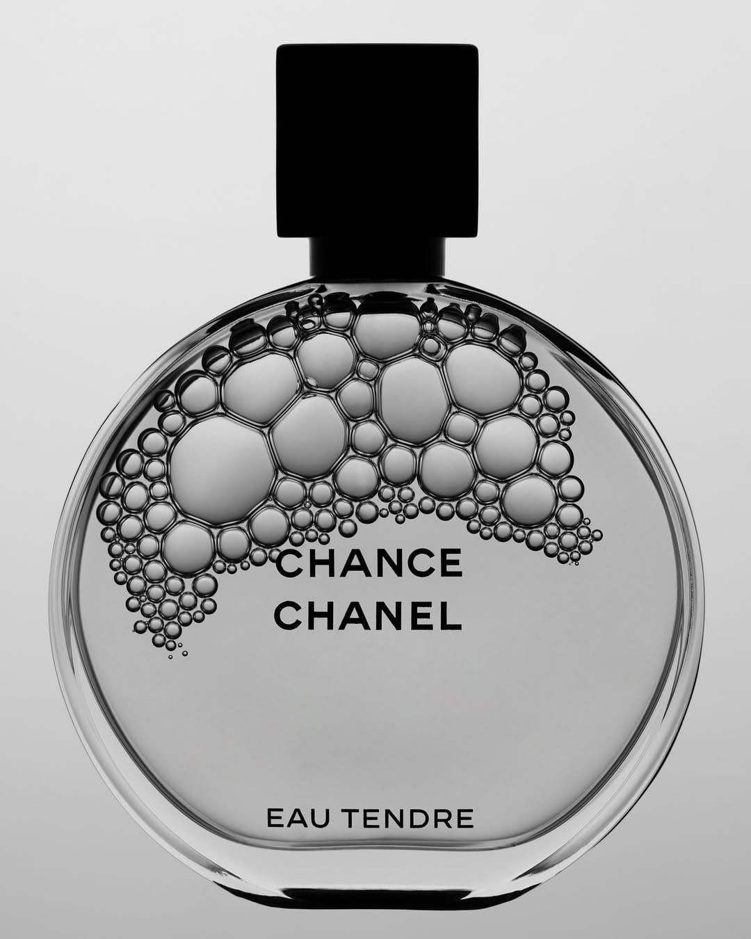
Conceptual bubbles in black and white
The bubble treatment for Chanel (@chanelofficial) is a smart way to reference the fragrance itself without showing liquid or a spray. It's conceptually connected to the product rather than just decorative, which is the right instinct.
Shooting in black and white strips out the actual color of Chance Eau Tendre, which is a significant trade-off. The pink is a core part of that product's identity, and losing it makes this feel more like a creative exploration than something you'd lead with.
The bubbles cascading from the cap down through the bottle read naturally, and the varying sizes keep it from feeling like a pattern. The typography placement works because the bubbles clear enough space for the logotype without crowding it.
Where it gets complicated is the bottle clarity. The circular form of Chanel's Chance bottle is one of its strongest design elements, and the bubble overlay competes with reading that shape cleanly. For an exploration shot it's interesting, but it would be tough to justify as a main image for that reason.