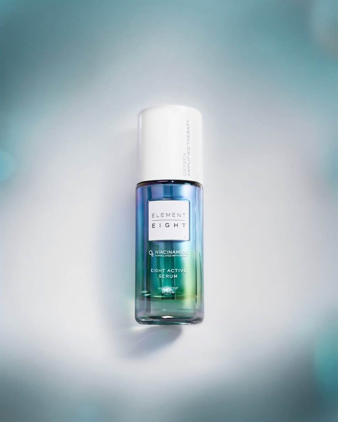
Element Eight serum
Clinical luxury and controlled lighting
They're leaning into a really clean, clinically-luxury skincare story here for Element Eight (@elementeight). Shot by Andrew Macpherson (@andrewmacpherson_official), the concept-wise, the "not doing the most, just what works" line matches the image: the bottle feels confident and minimal, not trying to scream for attention, which supports a science-first, efficient formula narrative. Composition looks intentional and premium: product is clearly the focus, strong vertical presence, lots of negative space, and everything else (if anything) recedes into the background so your eye stays on the serum. The light is polished and controlled. Crisp speculars on the glass, even gradients, no harsh distractions. It reads as high-tech and oxygen/"air" adjacent rather than moody or cozy. Retouching feels tight, with clean edges, no dust, and a slightly perfected texture that still feels believable. The bottle really is the most memorable element: strong shape, luxe finish. But the shot itself sits more in "solid e-comm" territory than a highly iconic campaign visual.