Clinique skincare
Classic clinical approach with informative packaging focus
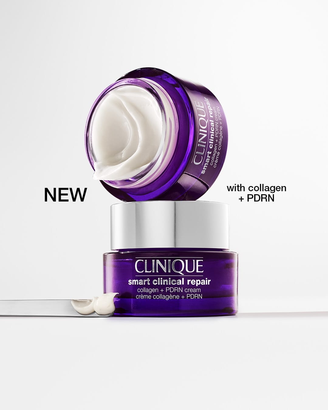
Yeah, this one from Clinique (@clinique) feels more old school. It's got that clinical pharmacy vibe: big jar, lots of text on the box, feels more like information than mood. The layout is just a straight-on shot with no props, but it feels a bit busy because the text is competing with the product instead of letting it breathe.
Colors are classic Clinique: white and purple with bold black text, but it comes off more like a dermatologist flyer than something sexy or premium. The light is bright and even but pretty flat, no shadows or depth, so it feels a little dated next to what other prestige skincare brands are doing now. It reads safe and informative but not very exciting or aspirational.

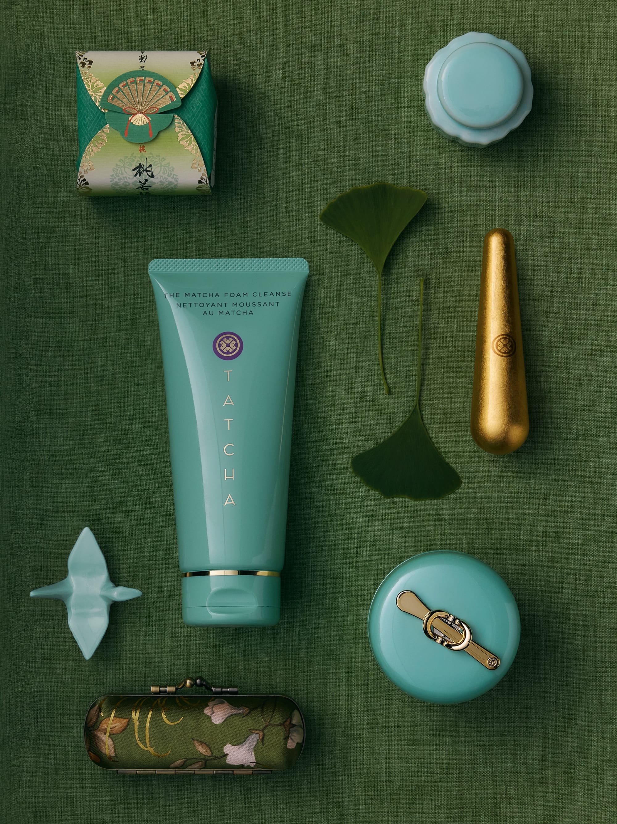 Tatcha skincare1/2
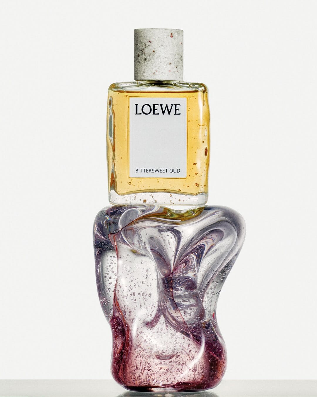 Loewe perfume1/3
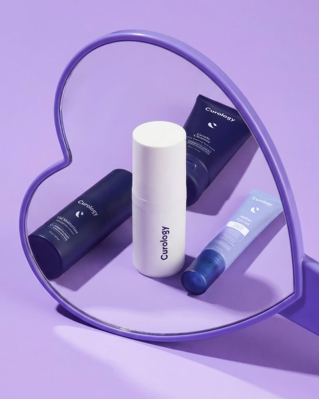 Curology's Valentine campaign1/6
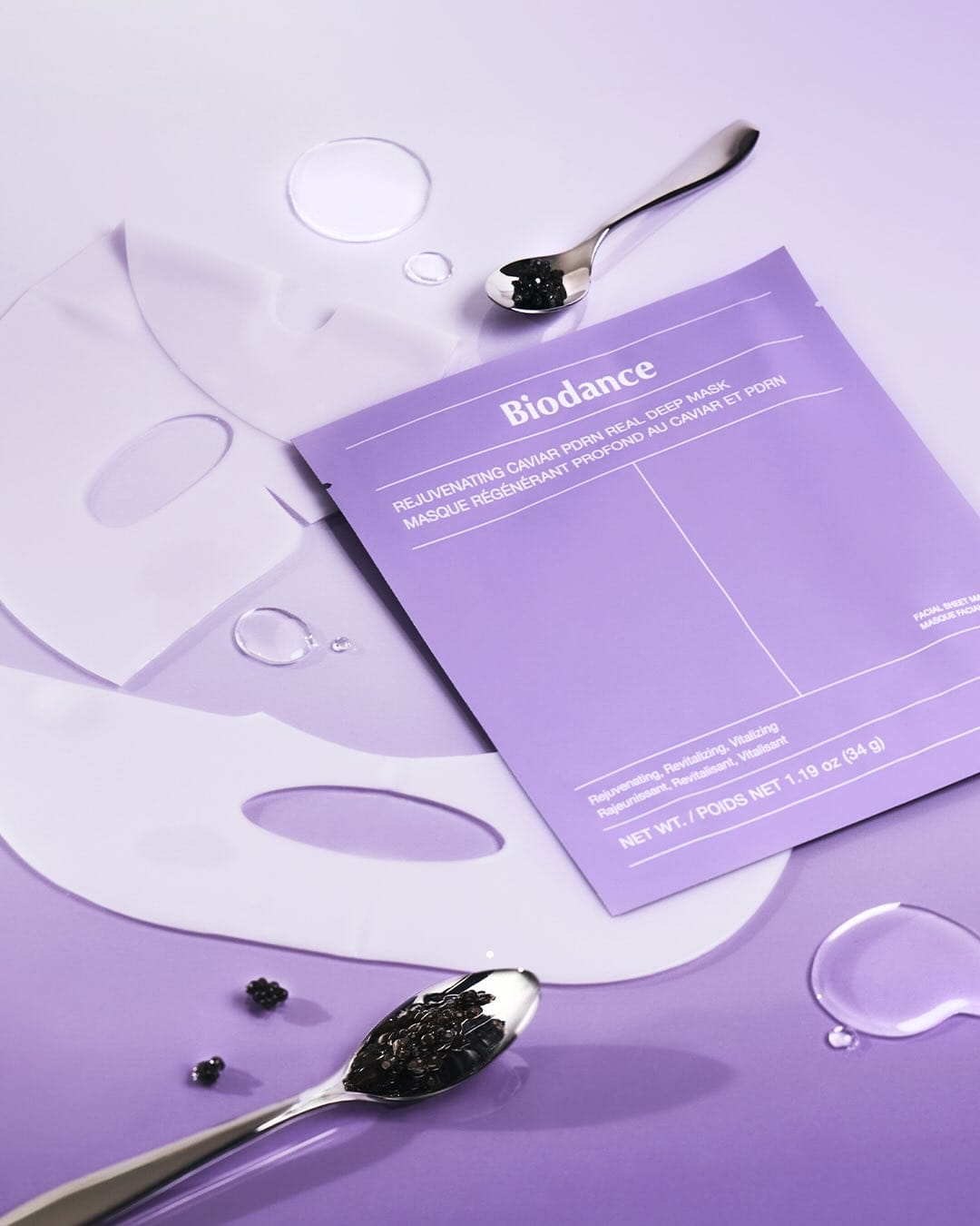 Biodance skincare1/3
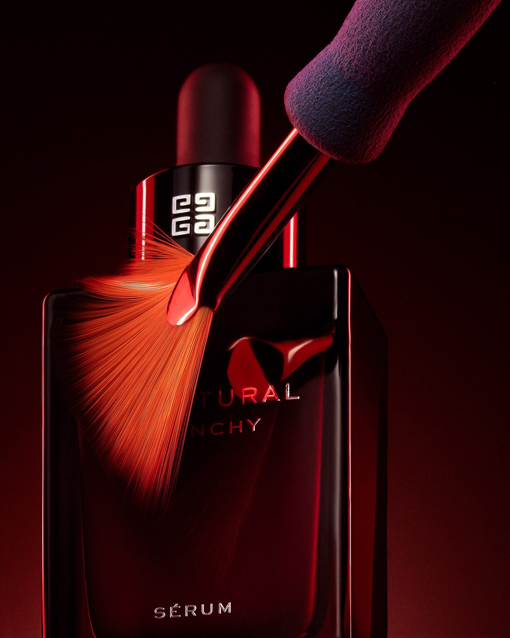 Givenchy Sculptural Serum1/3
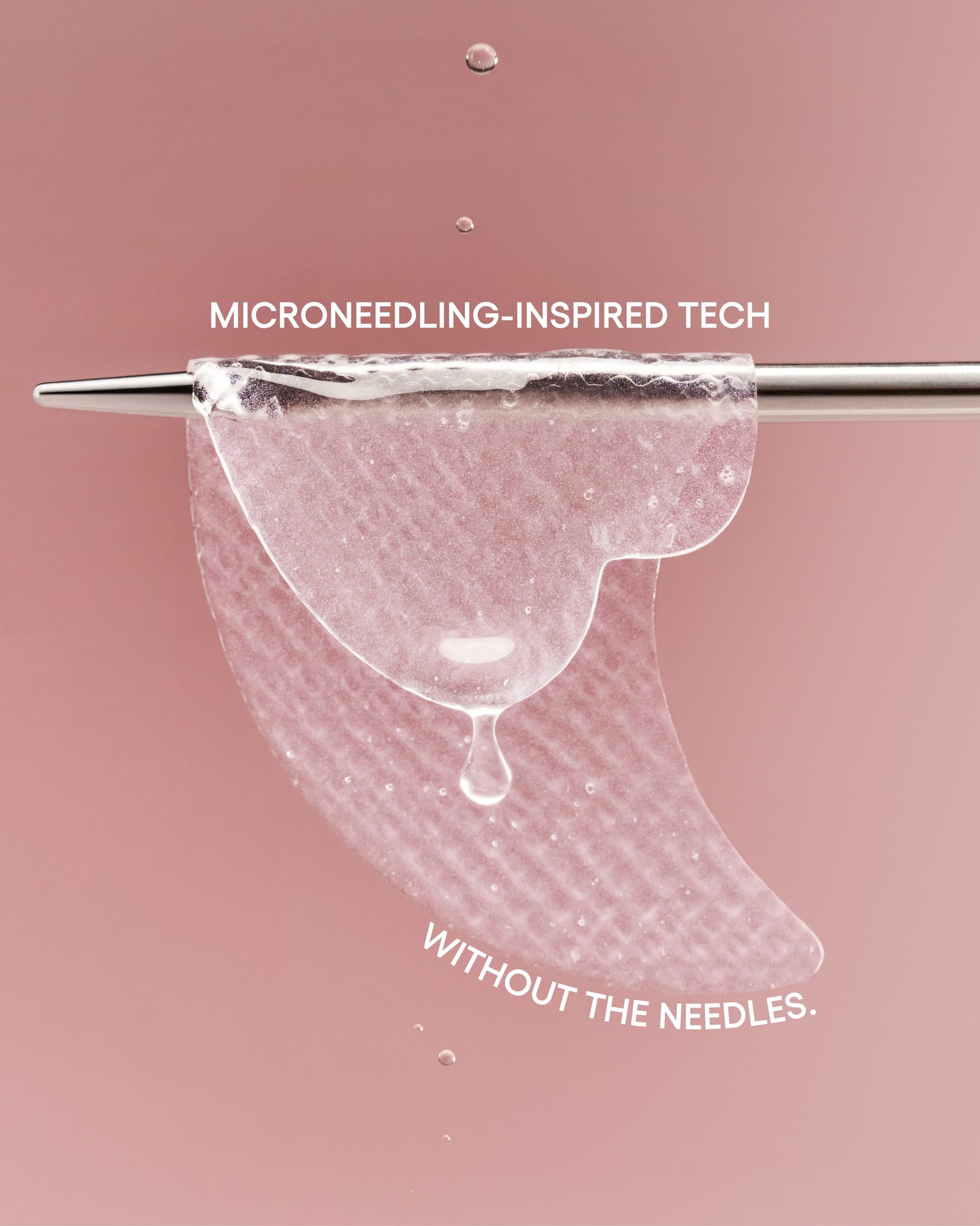 LANEIGE Bouncy & Firm patches1/4
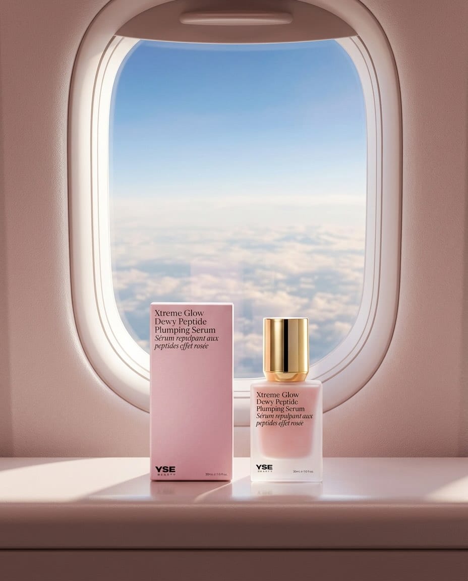 YSE Beauty's glow serum1/9
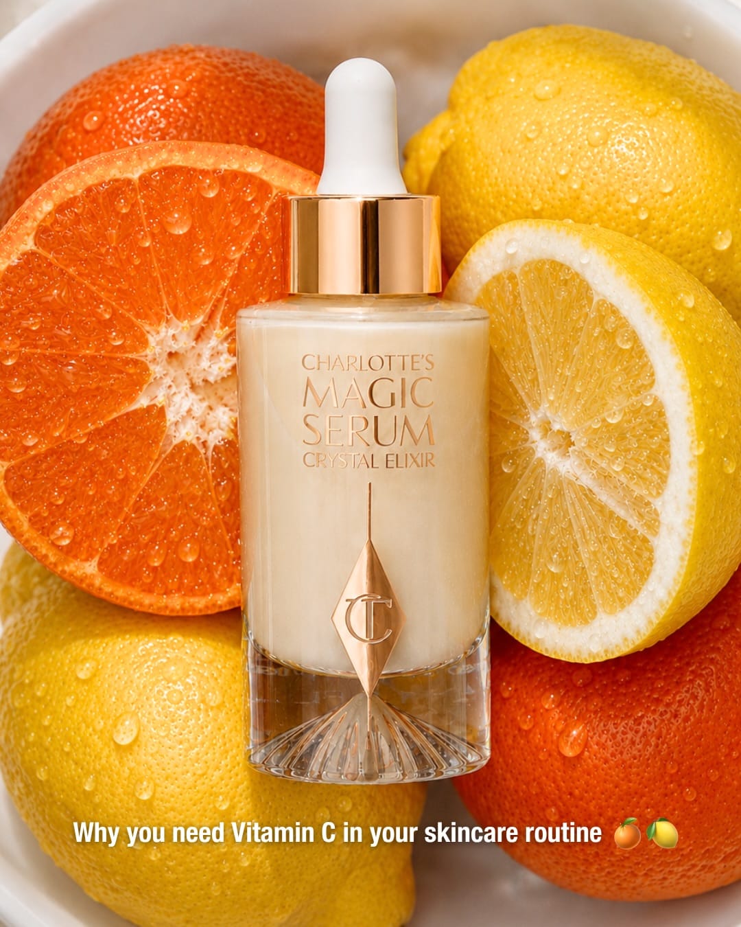 Charlotte Tilbury's AI-generated product imagery1/3
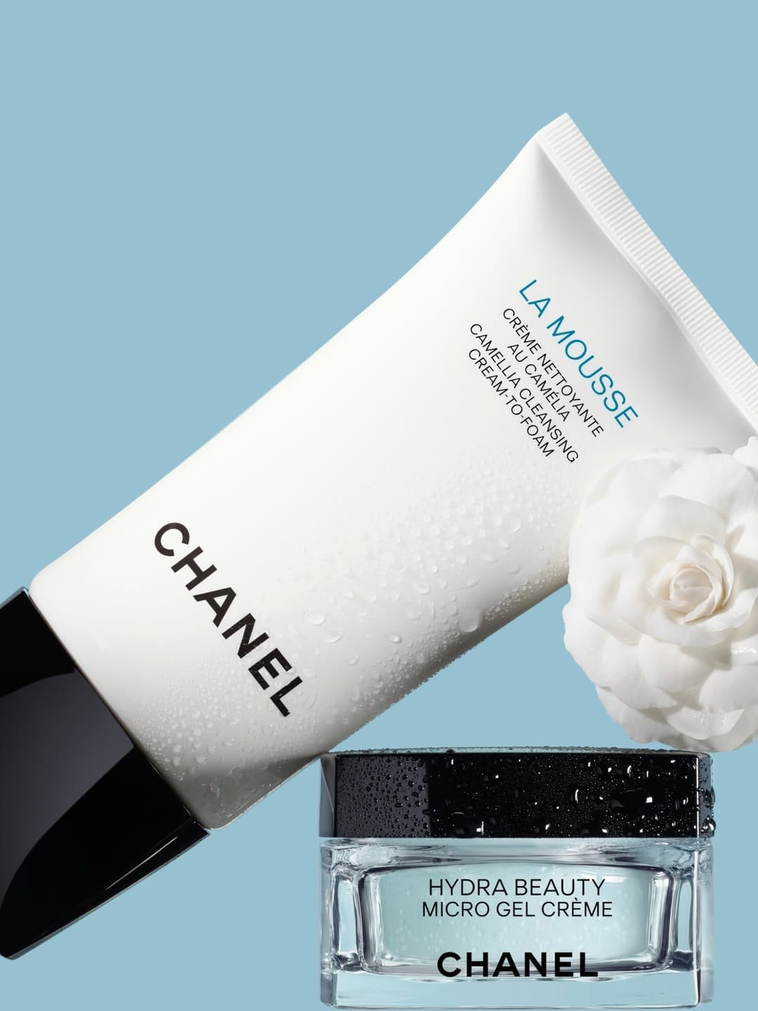 Chanel Hydra Beauty1/3
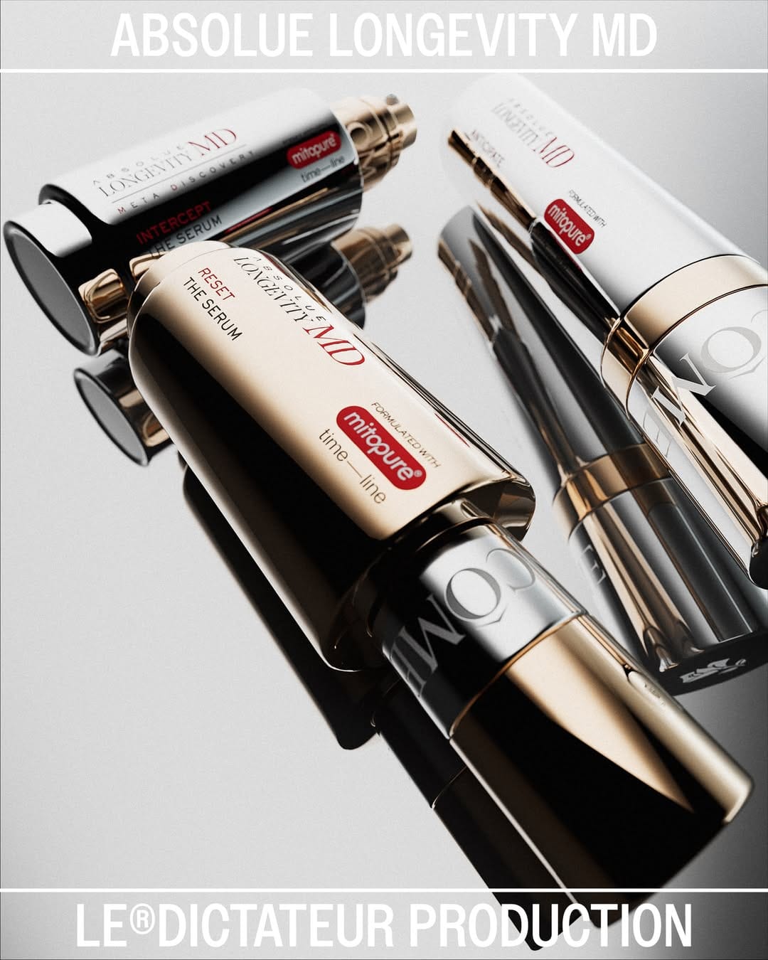 Lancôme anti-age1/4
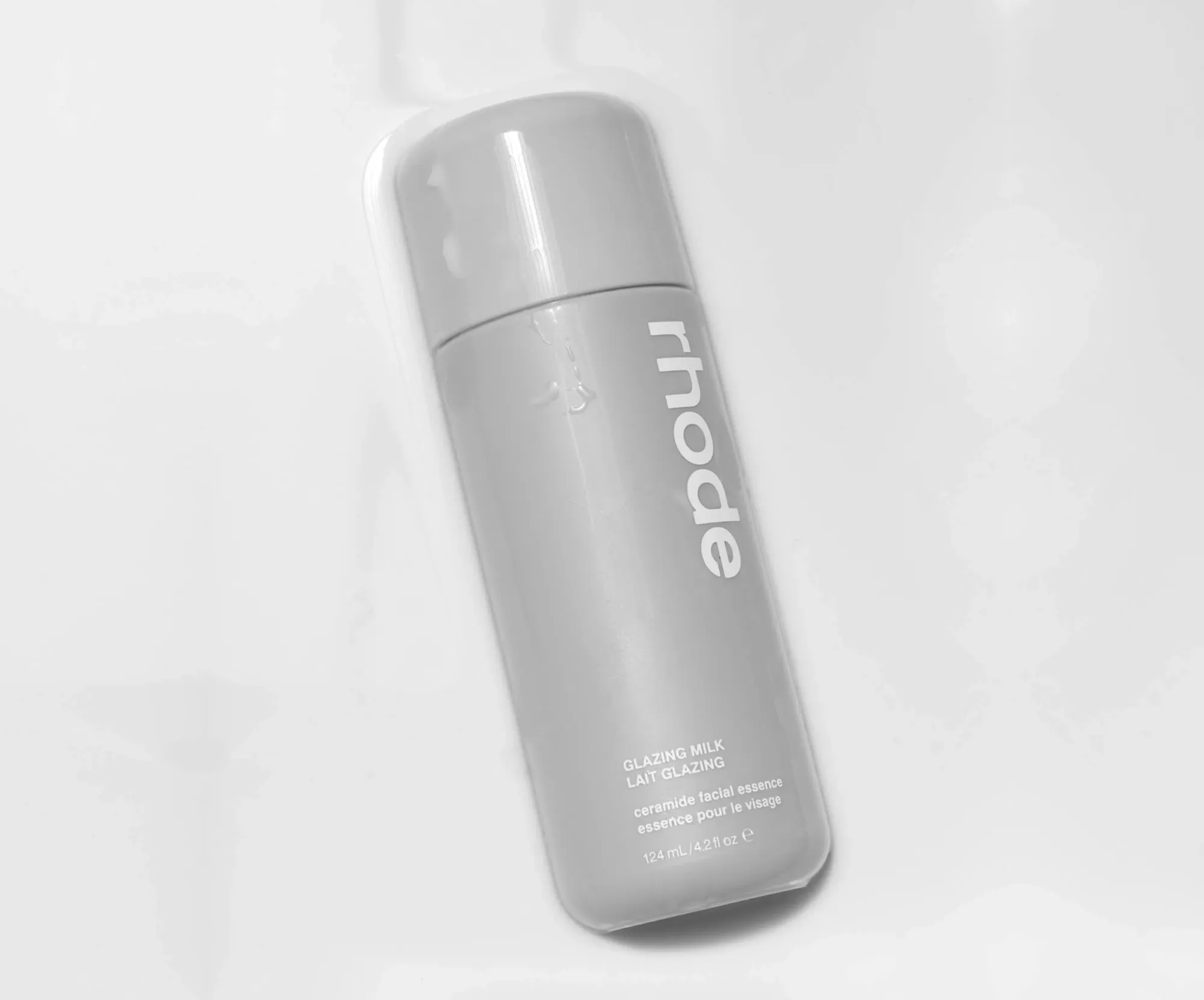 Rhode Skin1/4
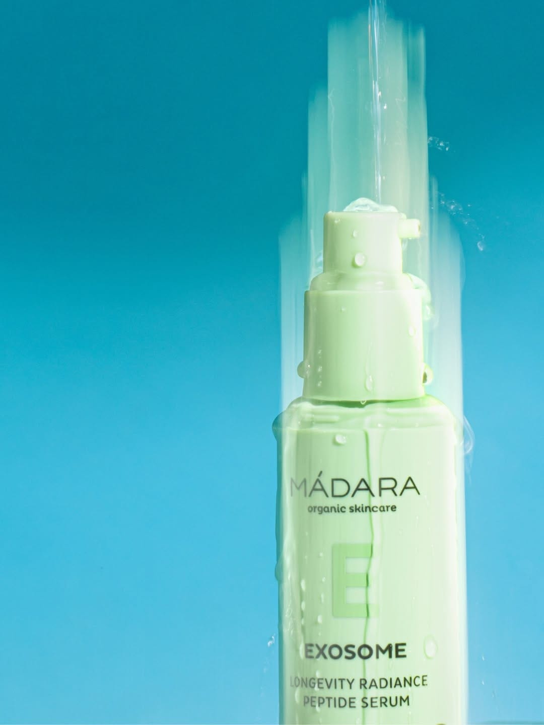 MÁDARA Organic Skincare1/3