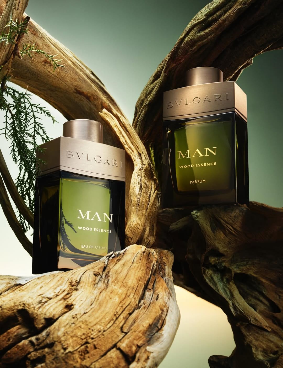
Bvlgari Man Wood Essence
Polished reflections and material contrast
From a commercial photography angle, this shot by Stills & Strokes (@stillsandstrokes) is doing a lot of things right. The tight crop on the bottle and cap makes it feel premium and focused: this is the main object, no distractions. The typography and embossing on the glass and metal are clearly legible, which is crucial for a luxury brand where the logo and product name carry half the value. Lighting-wise, they're pushing that polished, harder light with defined reflections to emphasize glass, edges, and that wood-metal contrast, which matches the whole "Man / Wood Essence / Parfum" story. Jacob Sutton's fragrance work for Bvlgari (@bvlgari) reads expensive, confident, and very on brand for a designer launch.

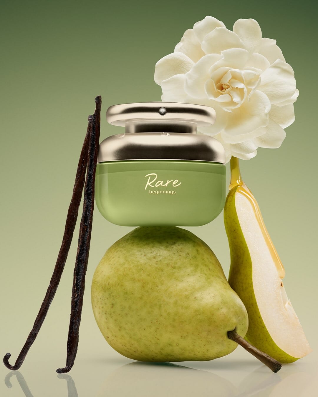 Rare Beauty's Rare Beginnings fragrance1/4
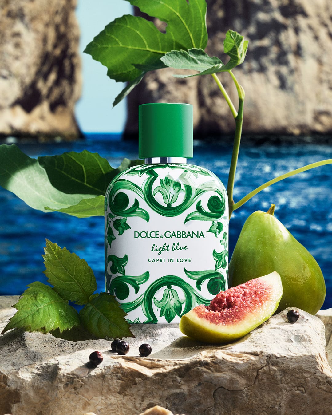 Dolce&Gabbana Beauty fragrance1/2
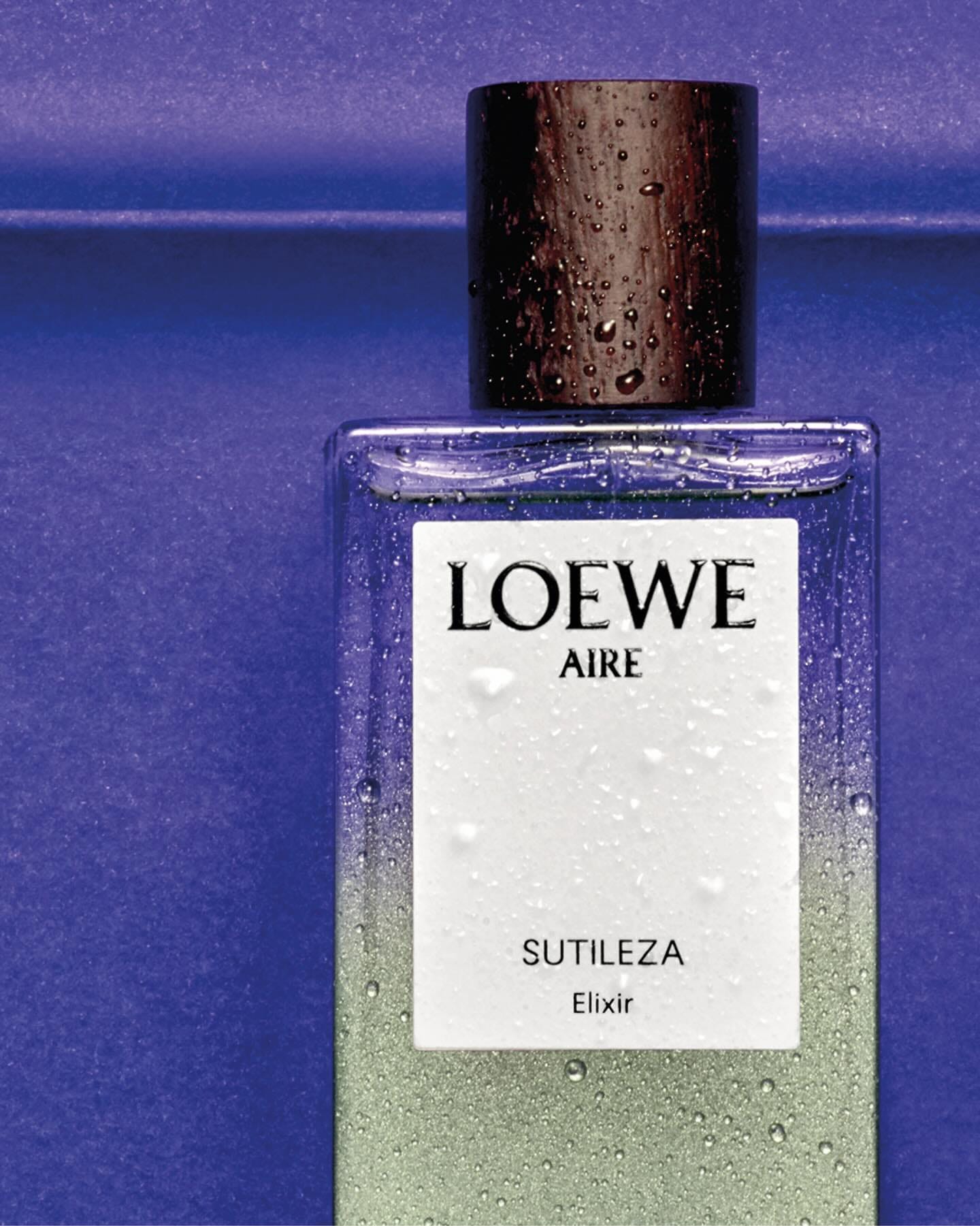 Loewe Aire Sutileza Elixir1/2
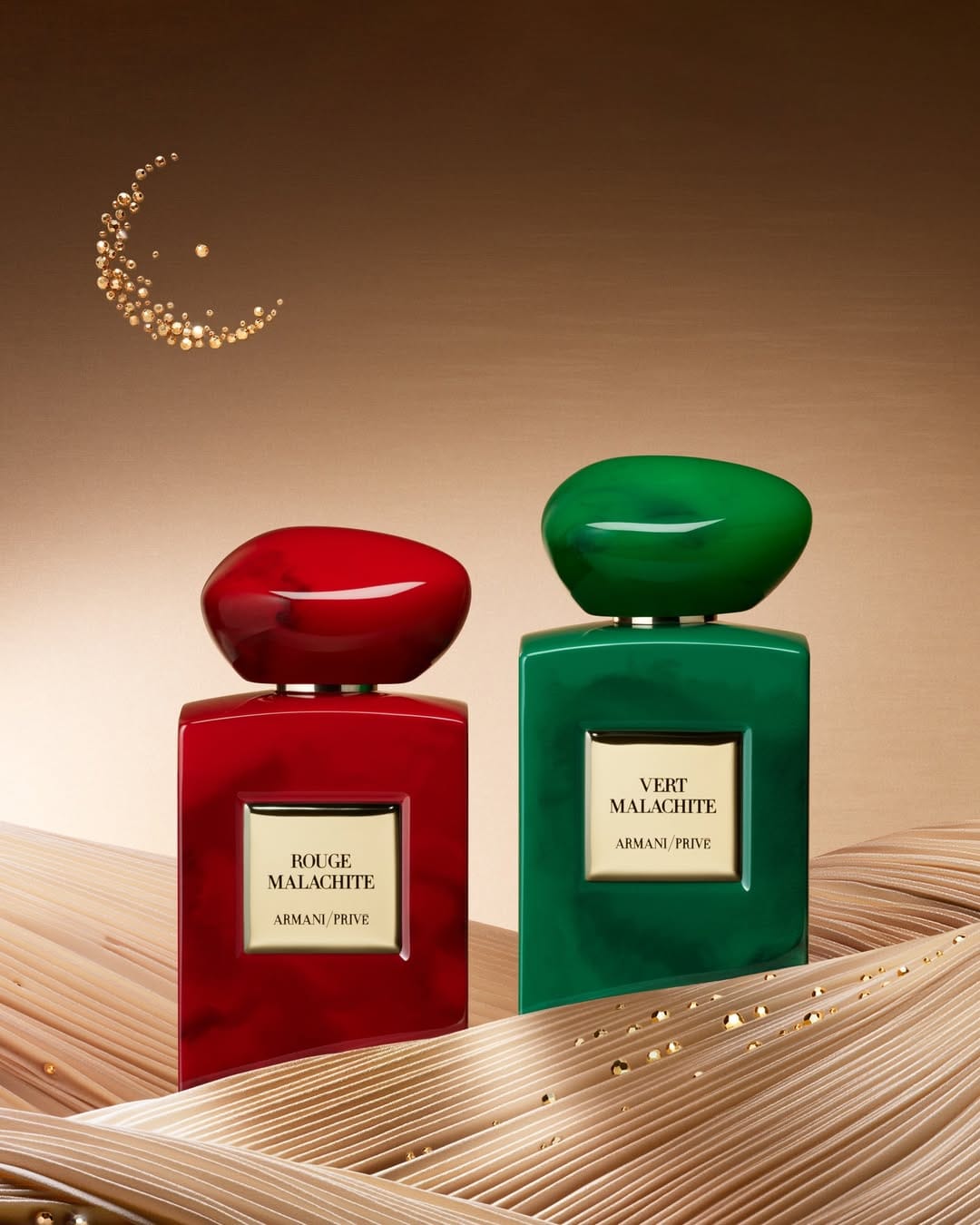 Armani Beauty Ramadan campaign1/3
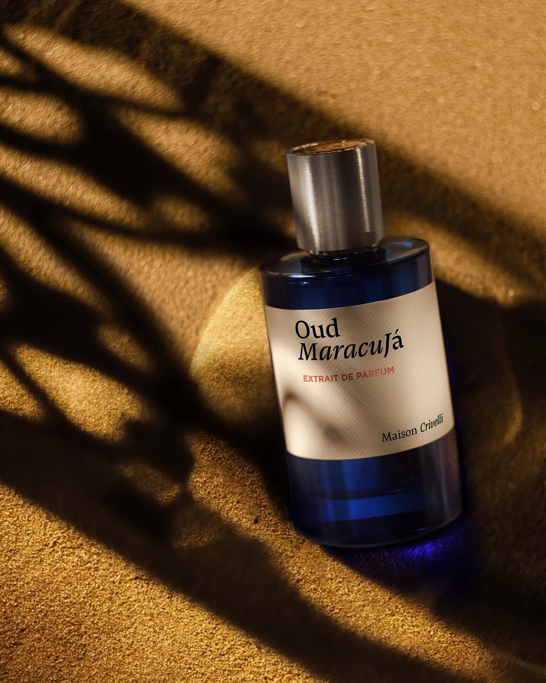 Maison Crivelli Oud Maracujá1/6
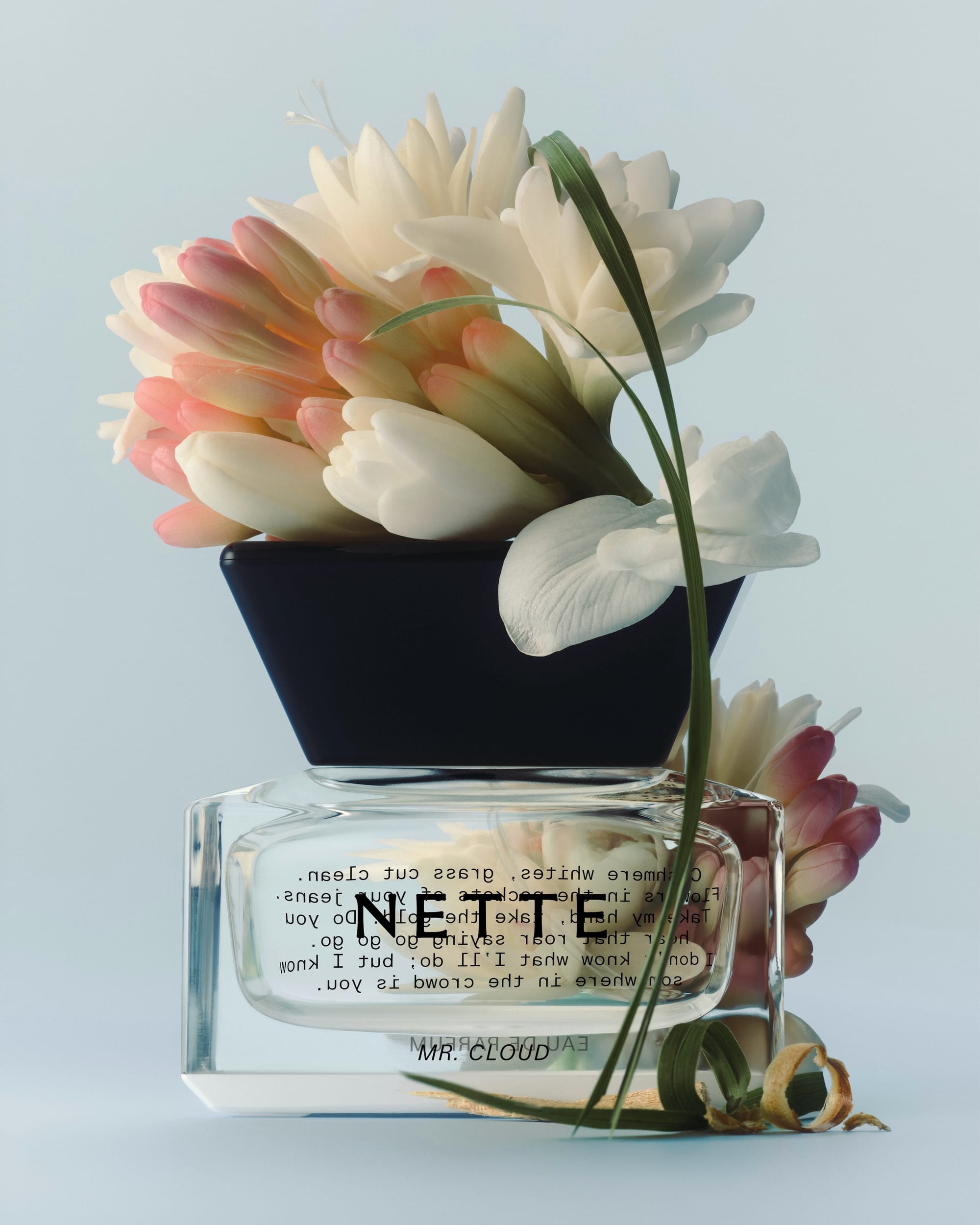 NETTE Mr. Cloud1/4
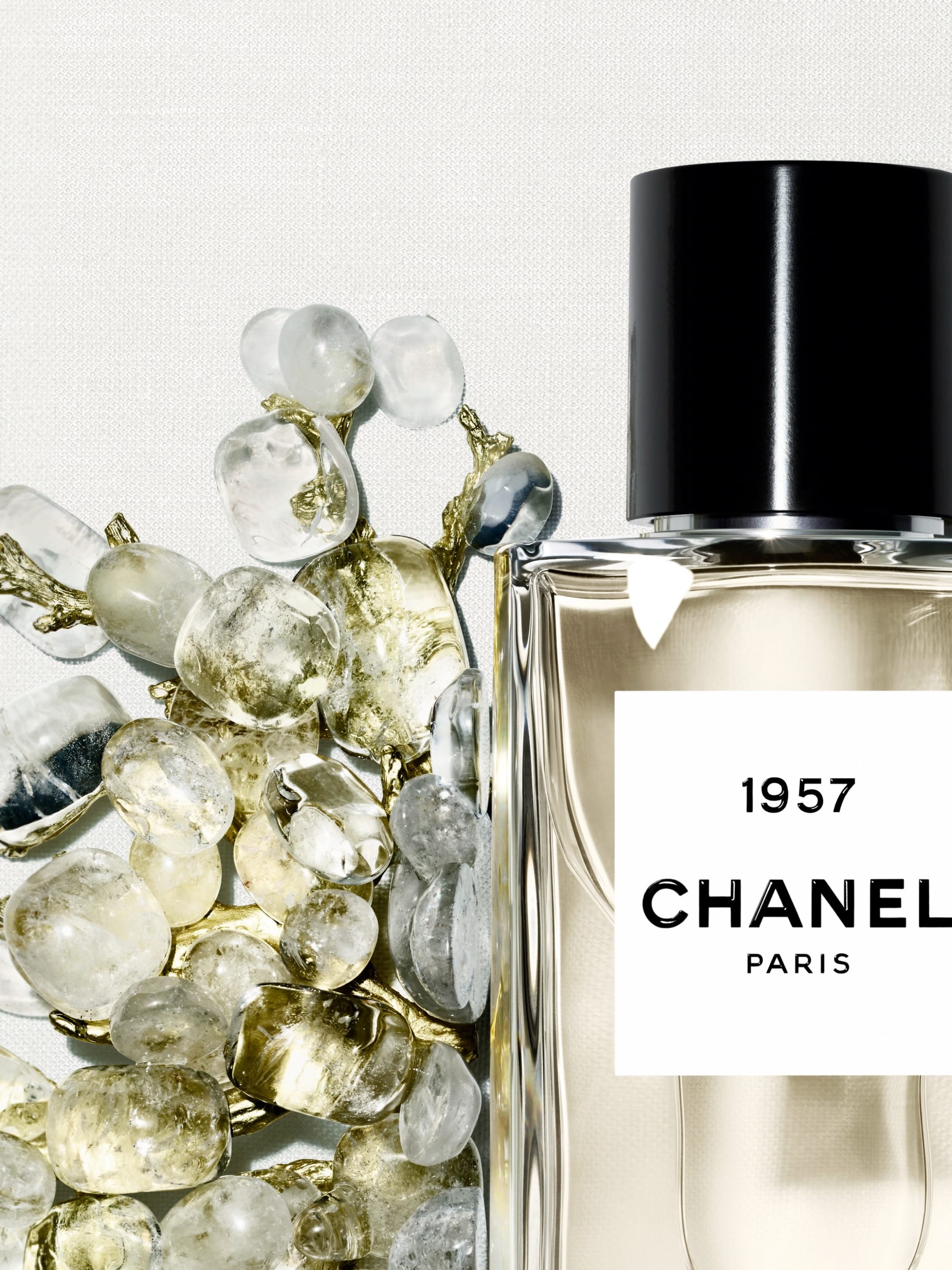 Chanel Les Exclusifs1/6
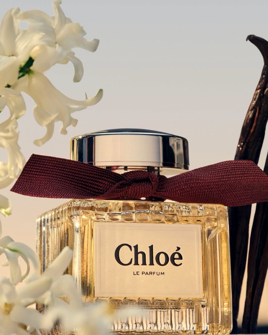 Chloé perfume1/5
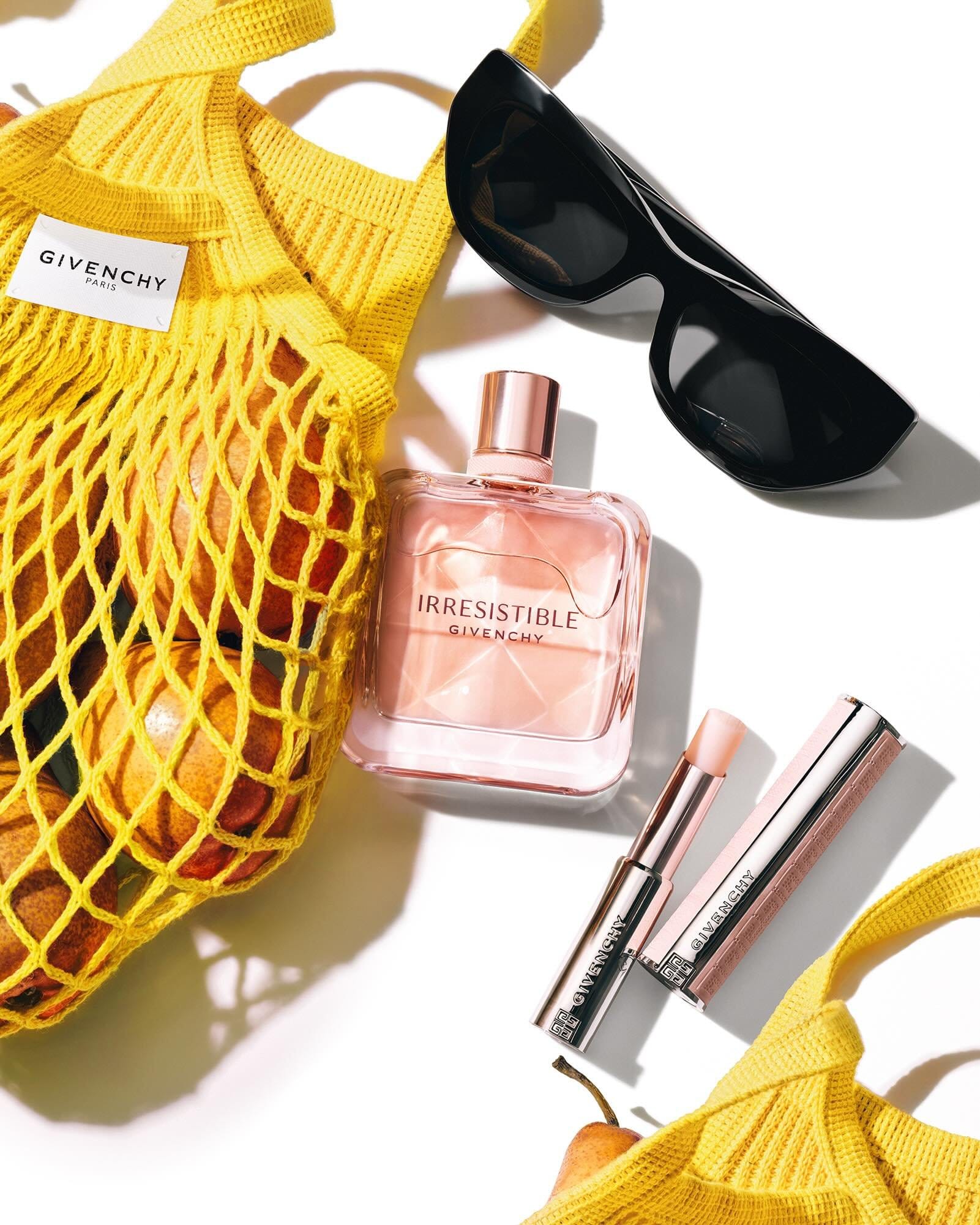 Givenchy beauty flat lay1/2
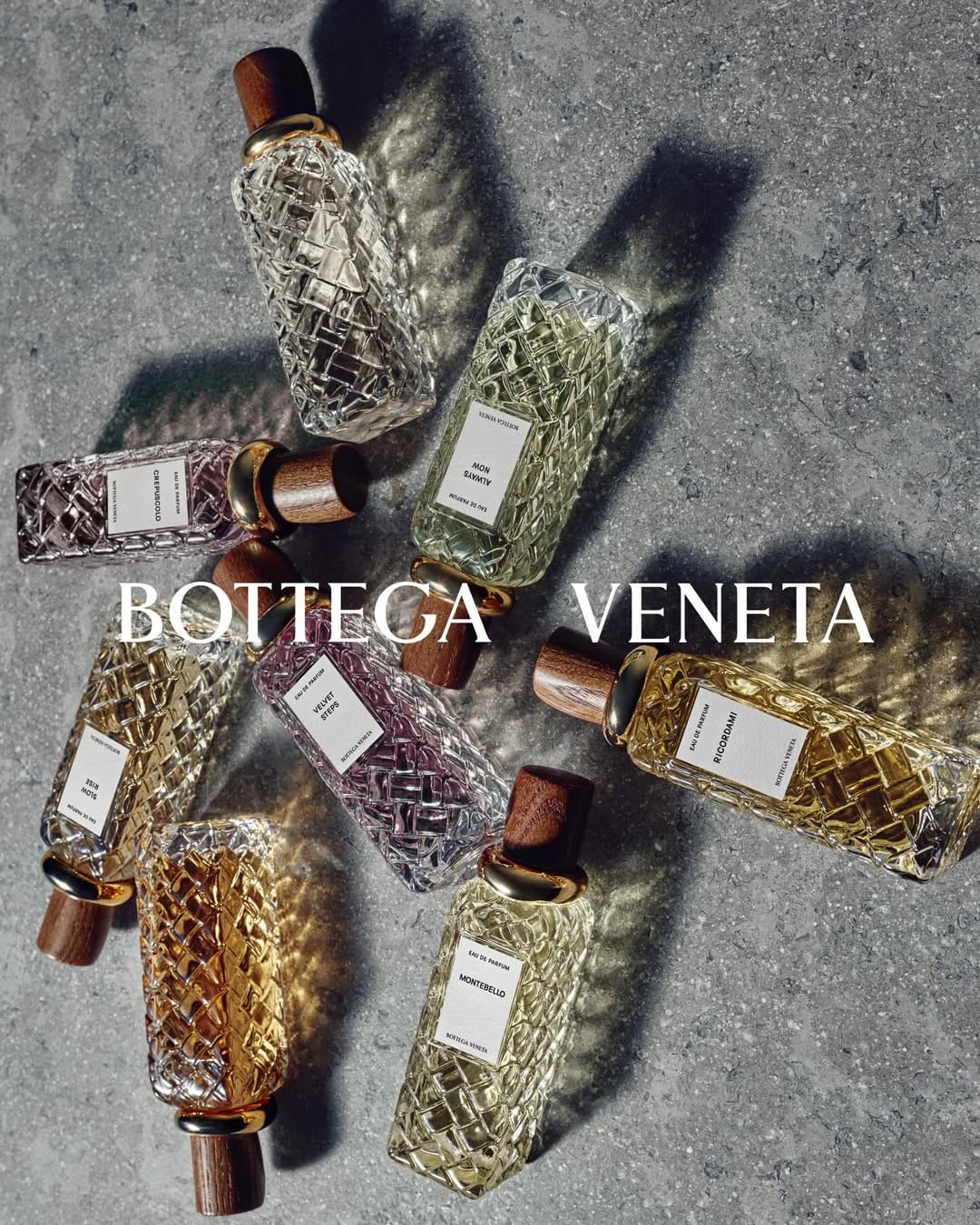 Bottega Veneta Alta Collection1/9
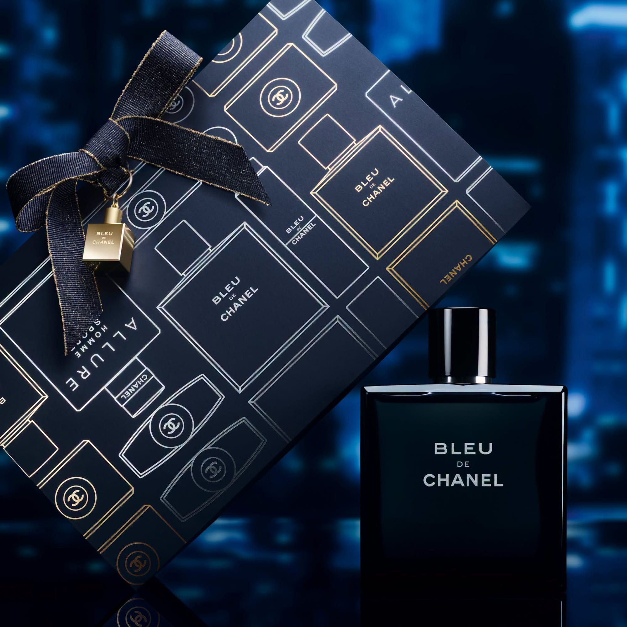 Chanel Bleu de Chanel1/4
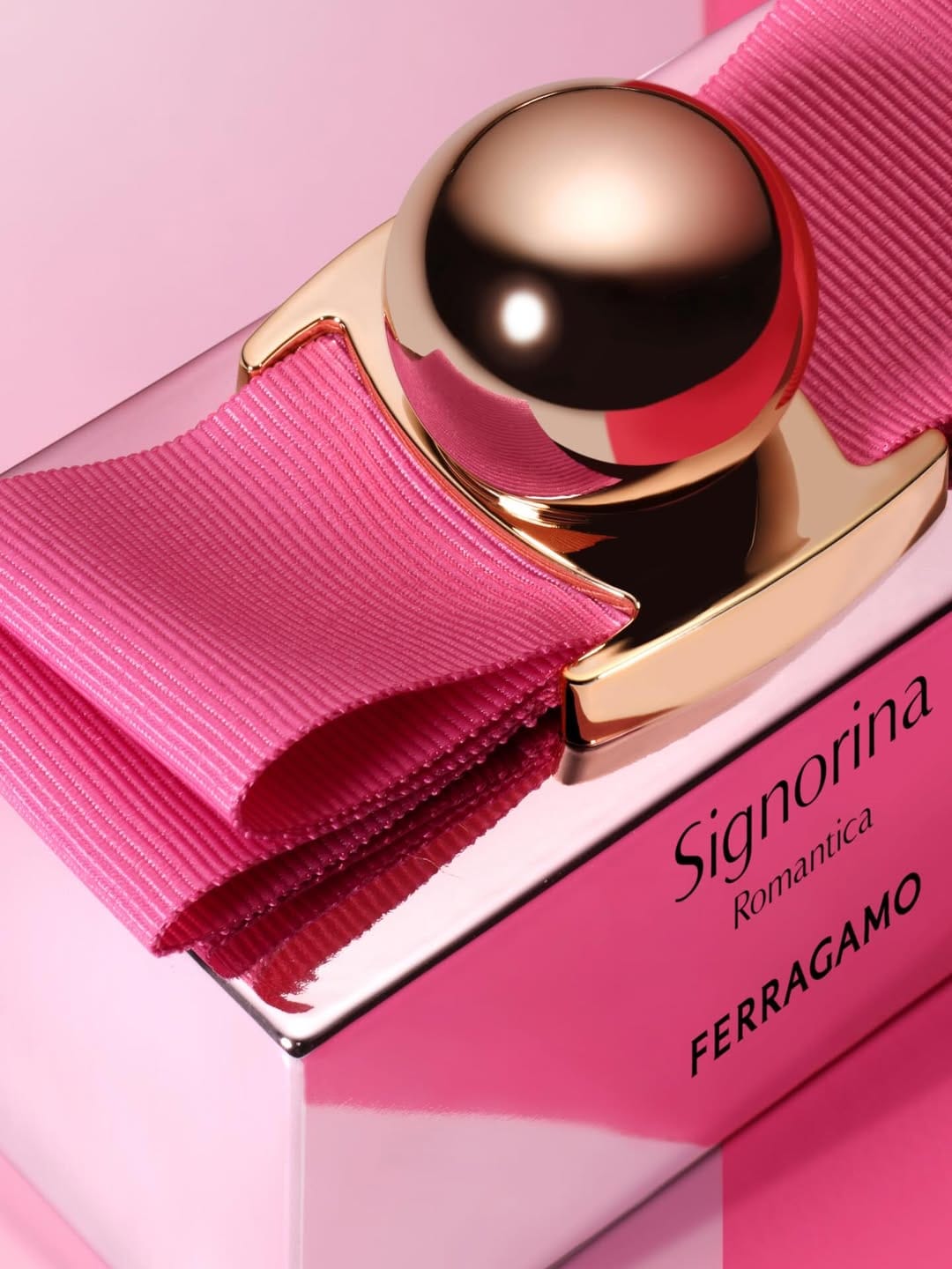 Ferragamo Signorina1/4