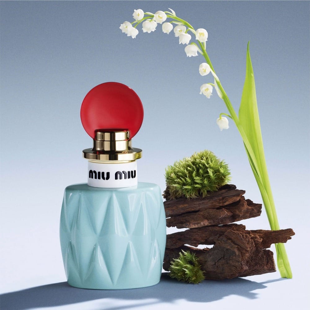
Miu Miu fragrance
Clean glass work and floral-friendly lighting
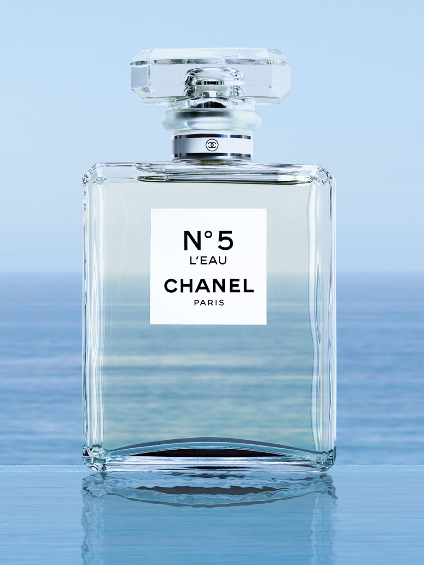
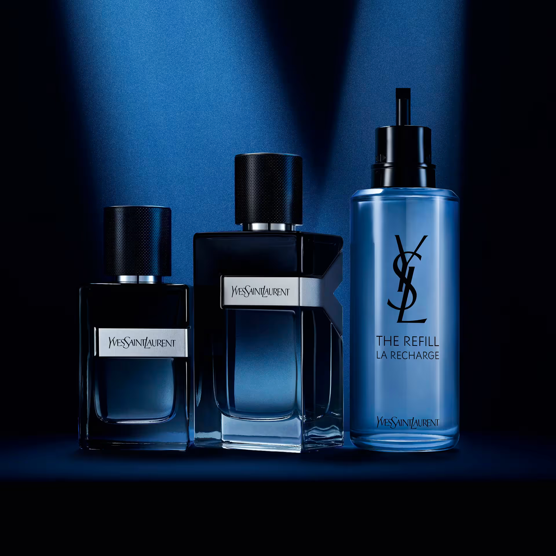
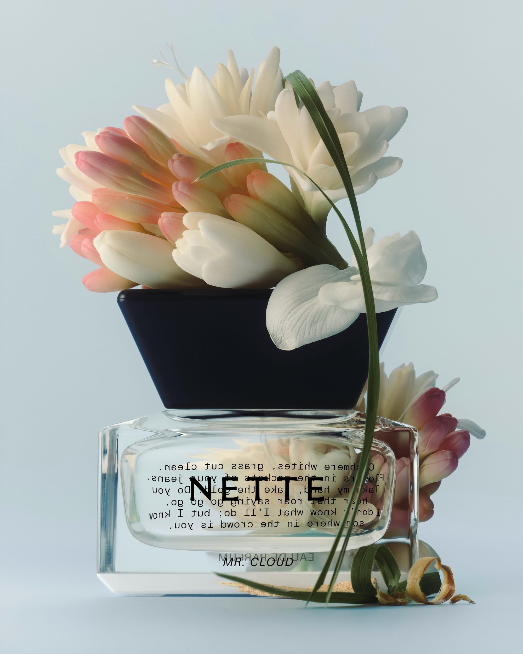
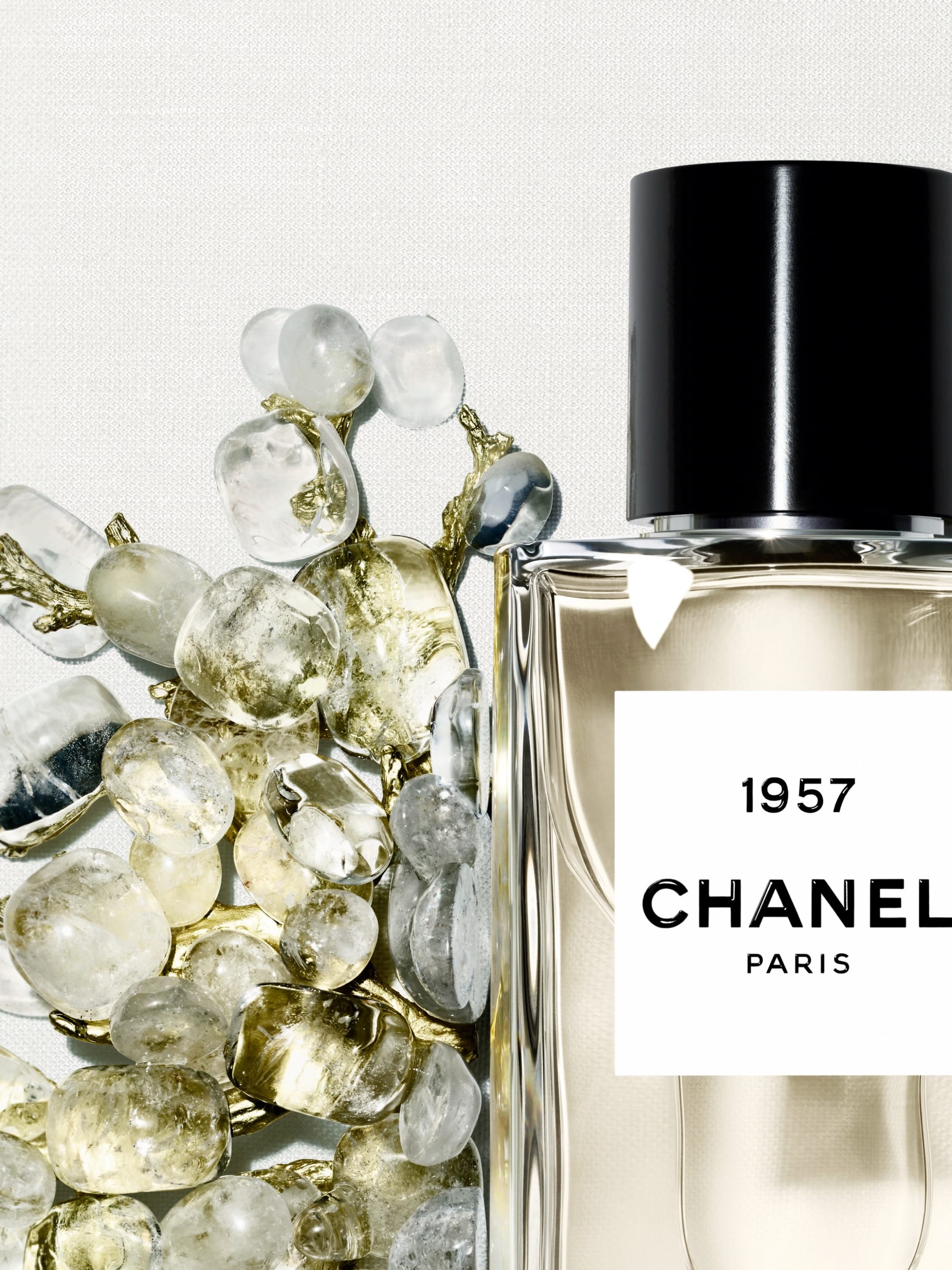
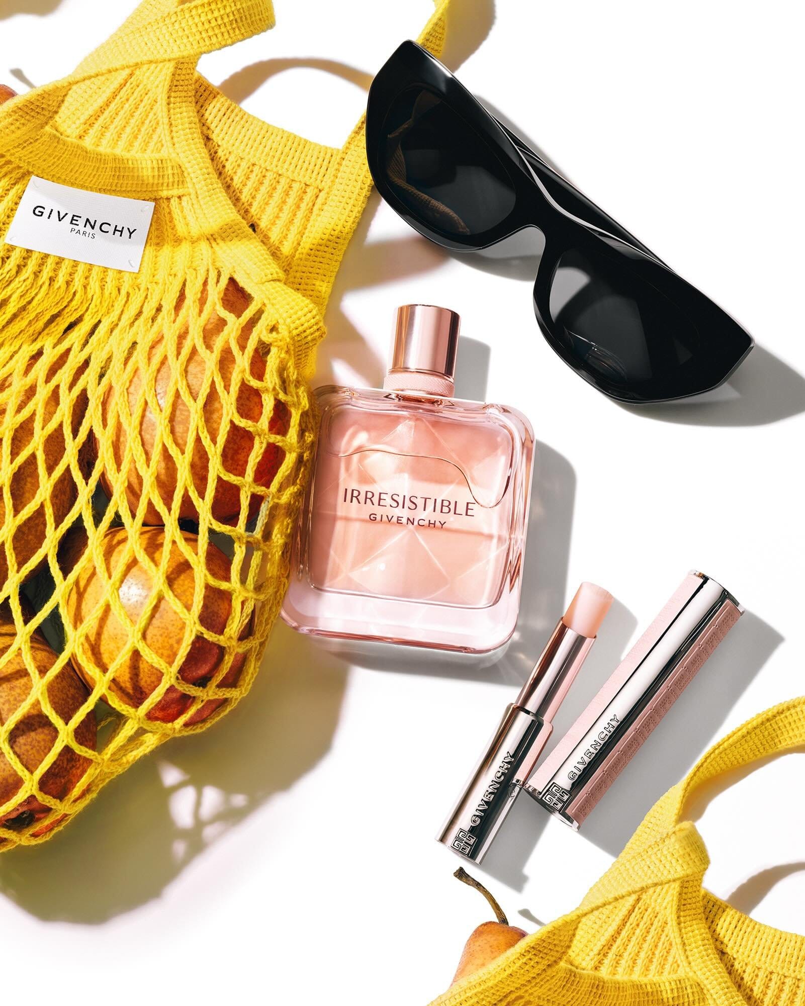
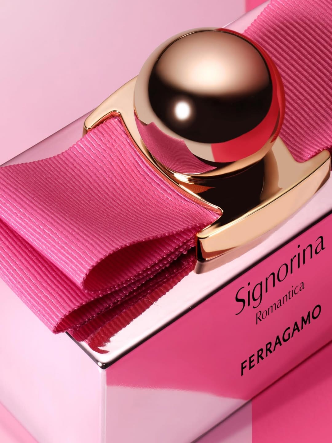
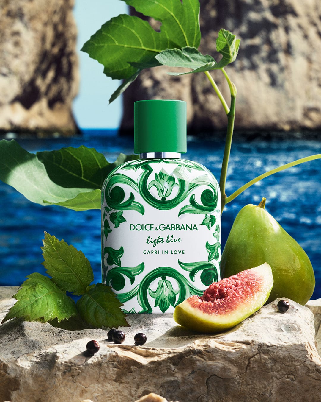
From a commercial standpoint, the concept is clear: a fresh, youthful, lily-of-the-valley story that matches the "joyfully floral" copy and feels very sellable. Composition-wise, the bottle takes center stage (as it should for a 30 ml EDP), and the framing feels straightforward and easy to read for social and online use. The lighting looks designed to keep things clean and polished, with enough contrast to show glass, facets, and liquid without killing the softness that a floral fragrance needs. Retouching seems focused on making the glass, label, and cap look flawless and crisp, so the viewer reads "premium designer fragrance" instantly. Overall it aligns well with Miu Miu (@miumiu)'s brand and fragrance retail aesthetic, but it's more functional than iconic. Memorable mostly as a solid, trustworthy product shot rather than a "wow, I can't stop thinking about that image" moment.