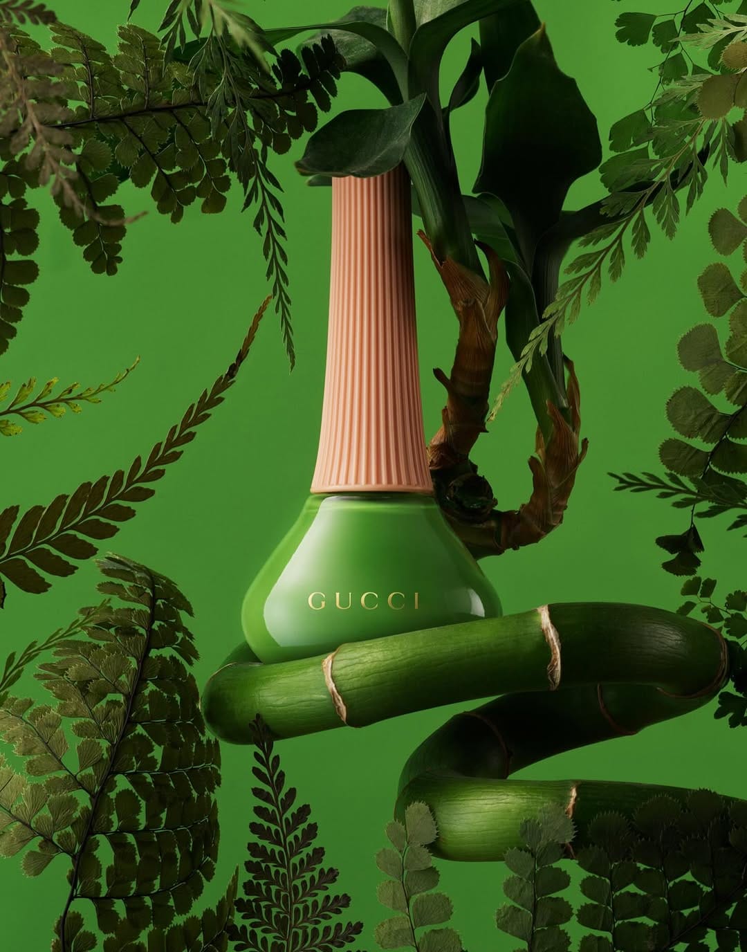
Gucci nail polish
Total green commitment with botanical layering
The color commitment here for Gucci Beauty (@guccibeauty) by Jonathon Kambouris (@the_mrjk) is total. Bottle, background, botanicals all locked into the same green, and it works because the tonal variation keeps it from going flat. The darker ferns framing the edges push the bottle forward without a single lighting trick needing to do that job.
The bamboo wrapping the bottle is the strongest choice. It ties the product to the botanical world without being generic "nature" staging. It's specific, structural, and visually interesting in a way that most floral prop work isn't.
The peach neck is the only contrast in the entire frame, and placing the gold Gucci logo right at that color break was deliberate and correct. The layering of real botanicals against what reads as a painted or composited background adds dimension that a straight studio shot wouldn't have. Lush without being chaotic, and nothing in this frame feels accidental.

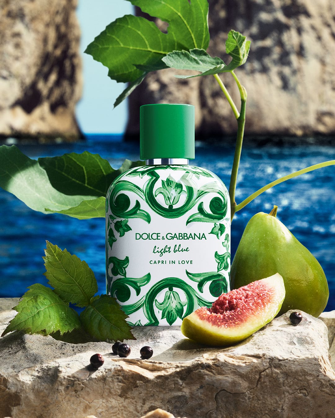 Dolce&Gabbana Beauty fragrance1/2
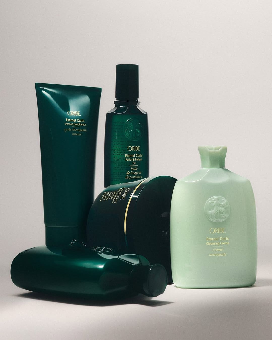 Oribe haircare
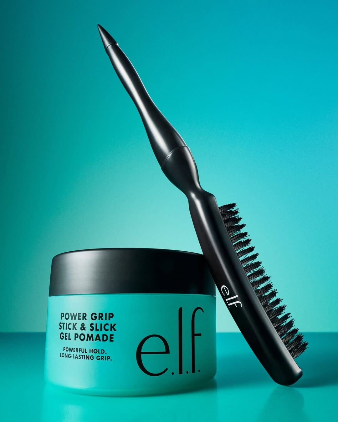 e.l.f. Cosmetics haircare1/3
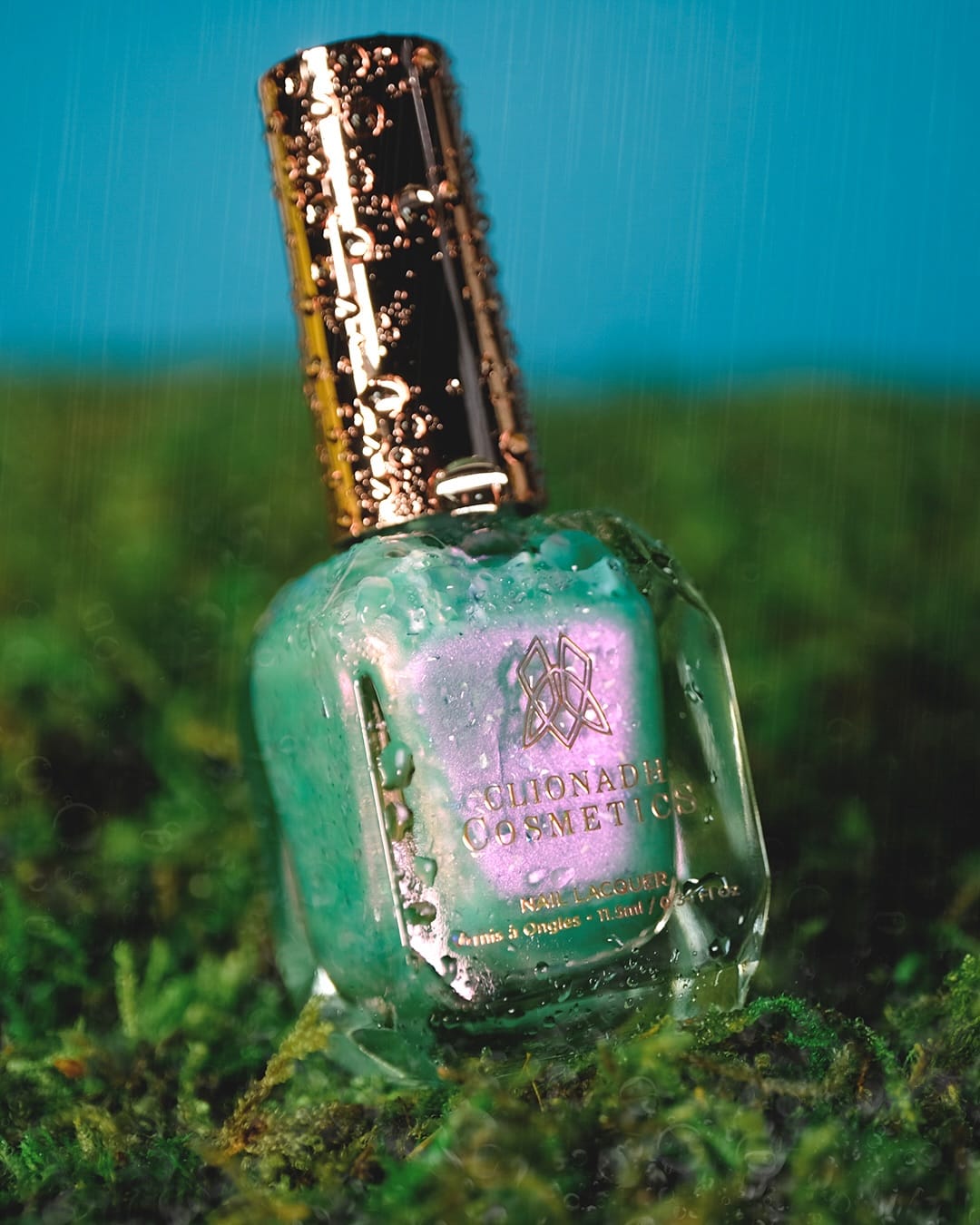 Clionadh Cosmetics' Ophelia
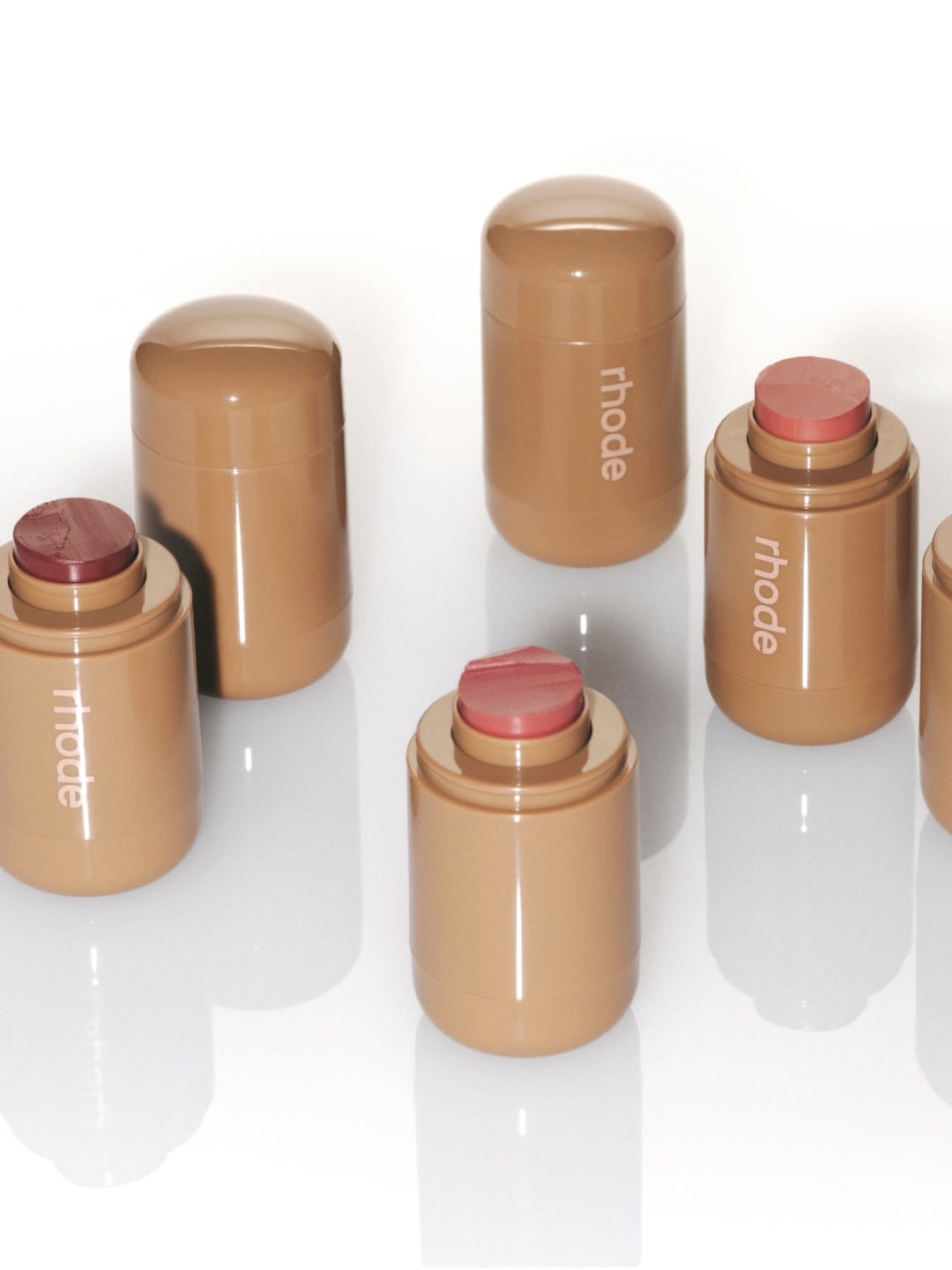 Rhode Skin blush sticks1/2
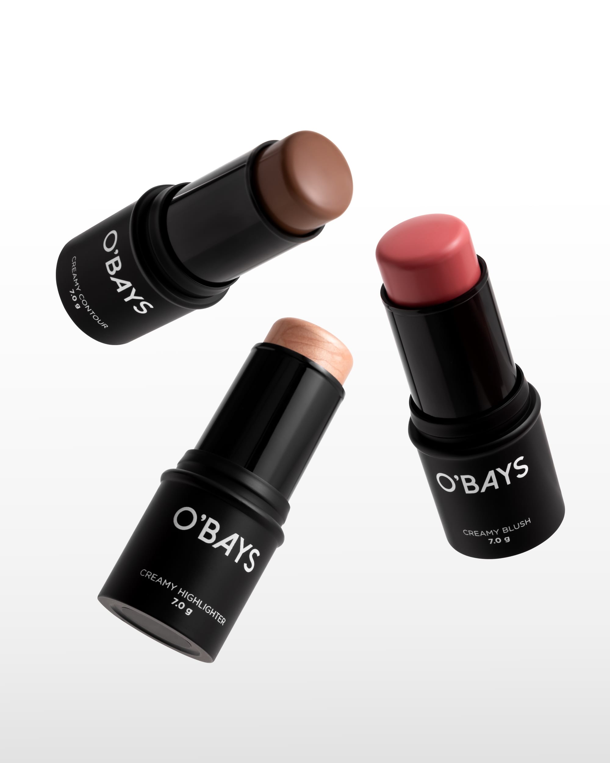 O'BAYS cosmetics1/3
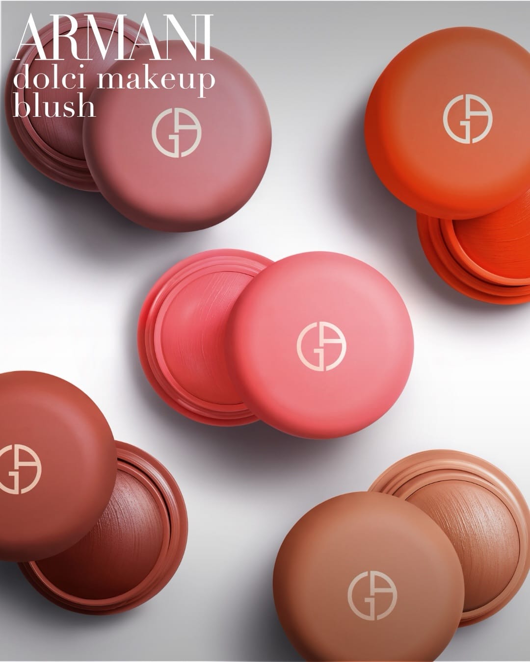 Armani Beauty blush compacts1/4
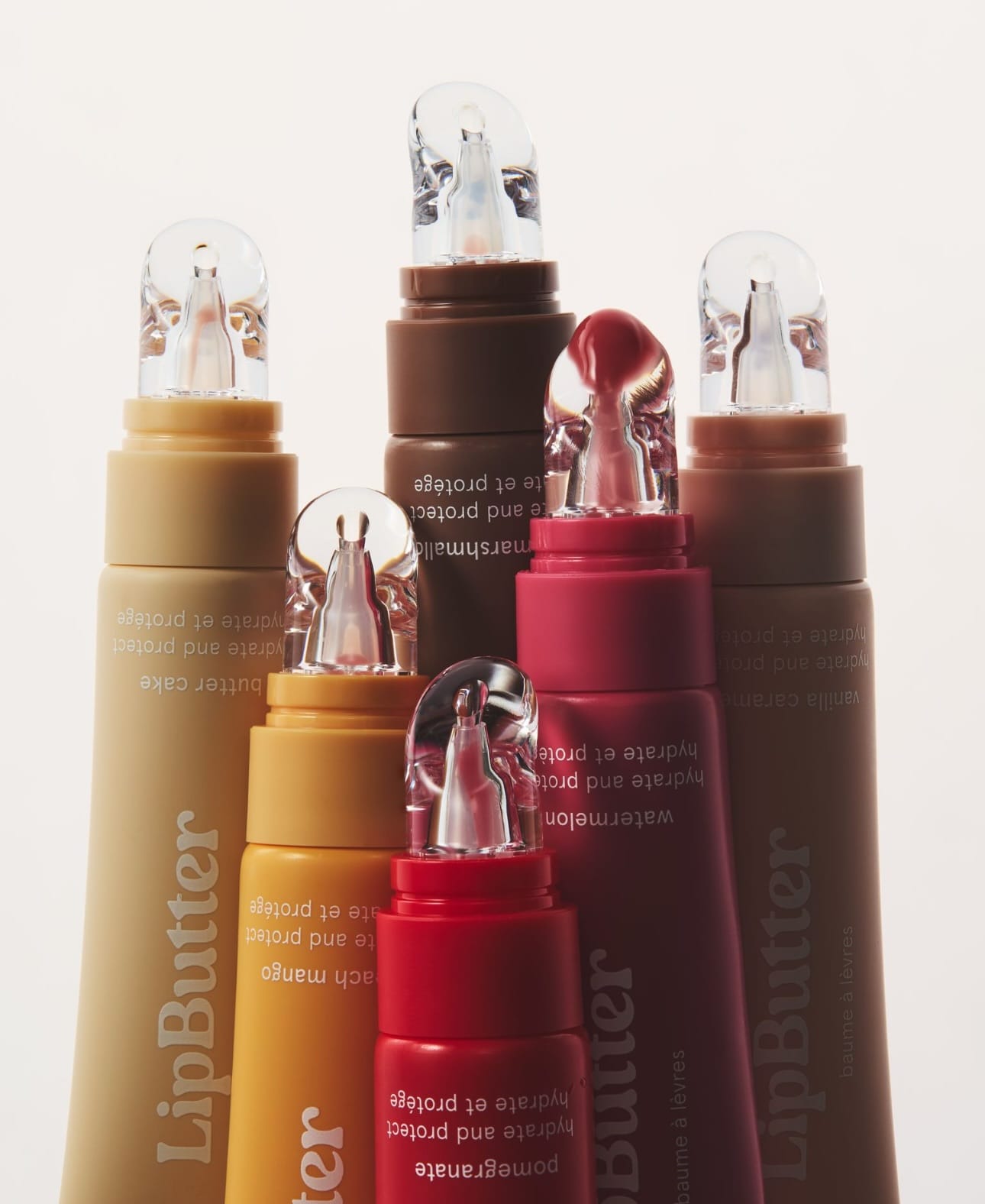 Kylie Cosmetics lip butters1/3
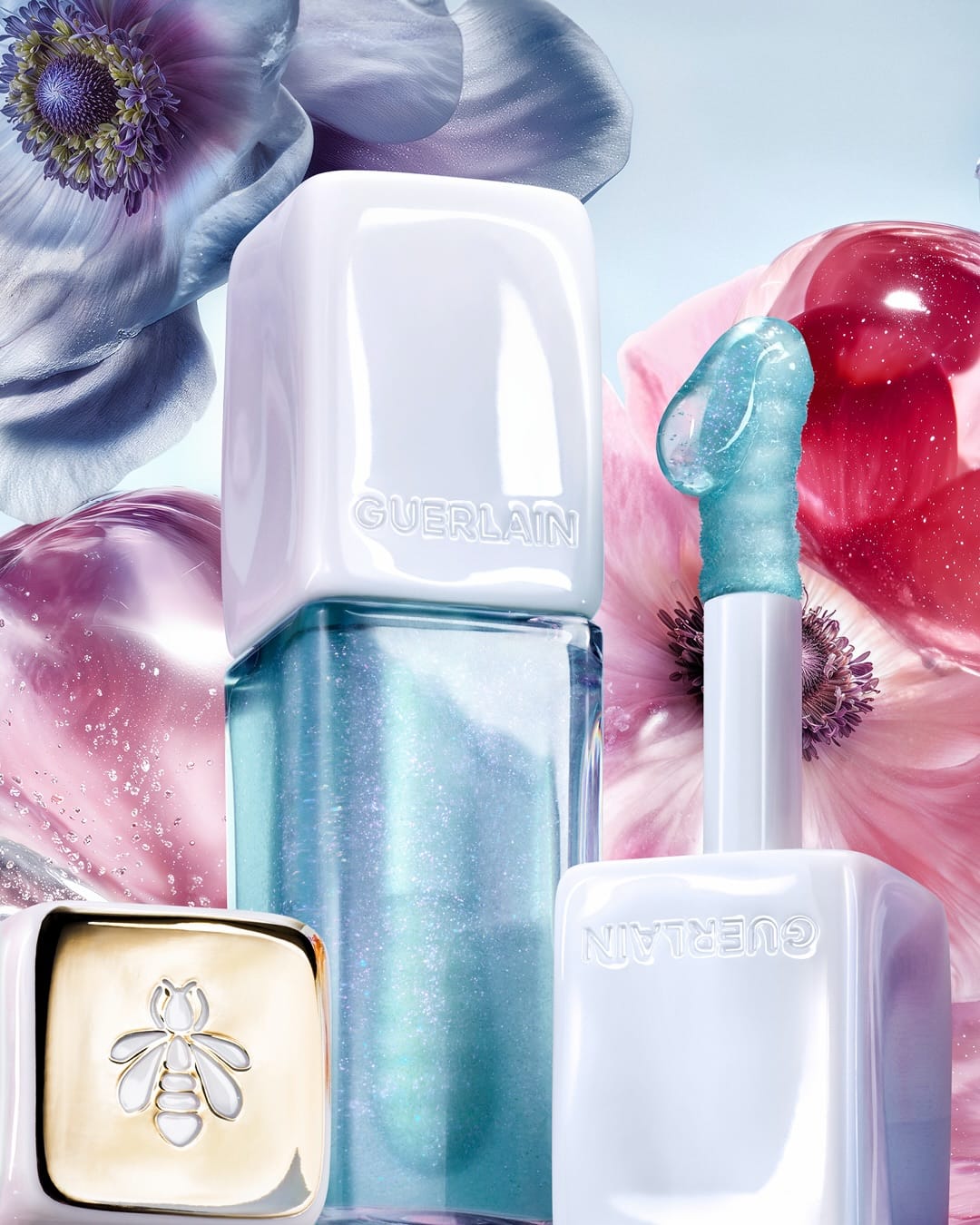 Guerlain KissKiss Bee Glow1/2
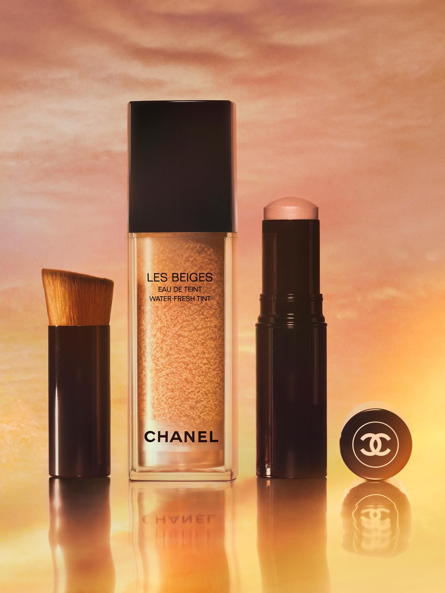 Chanel Les Beiges1/2
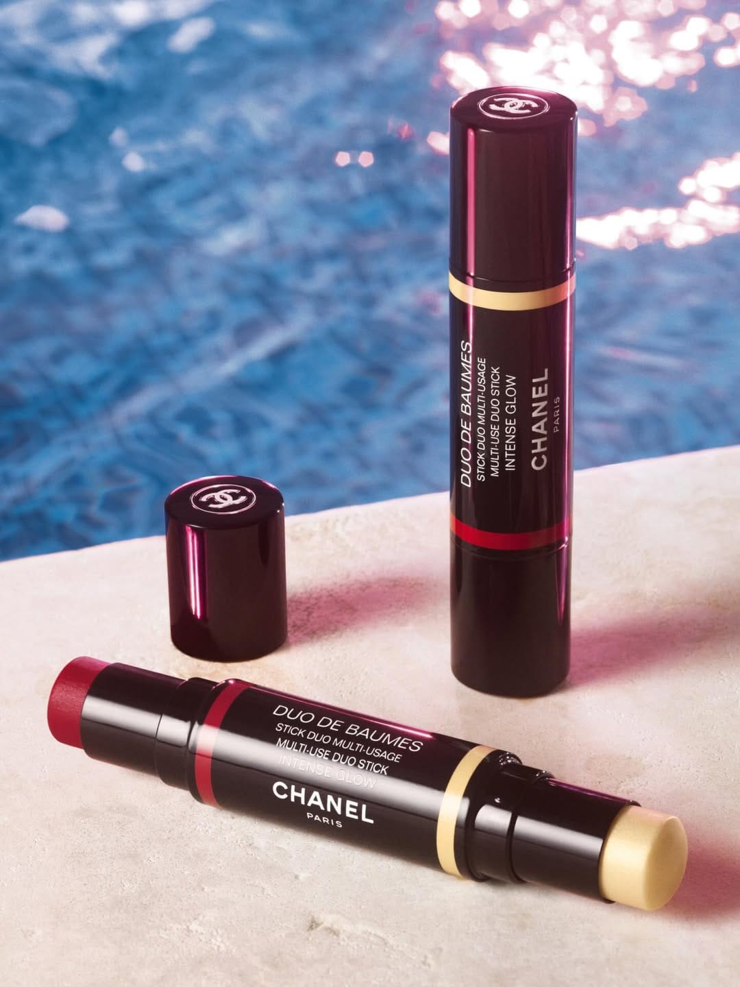 Chanel Duo de Baumes1/4
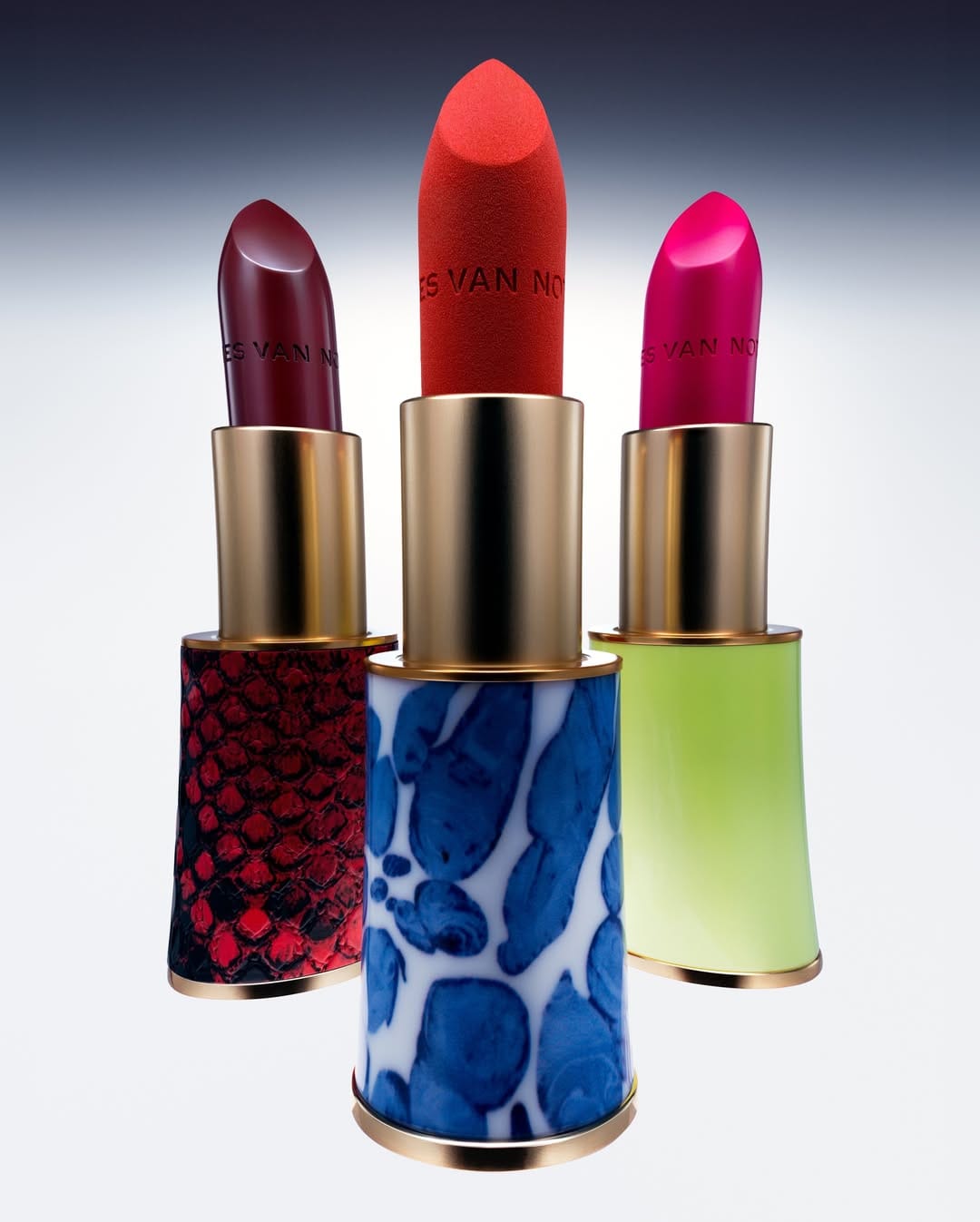 Dries Van Noten lipstick1/6