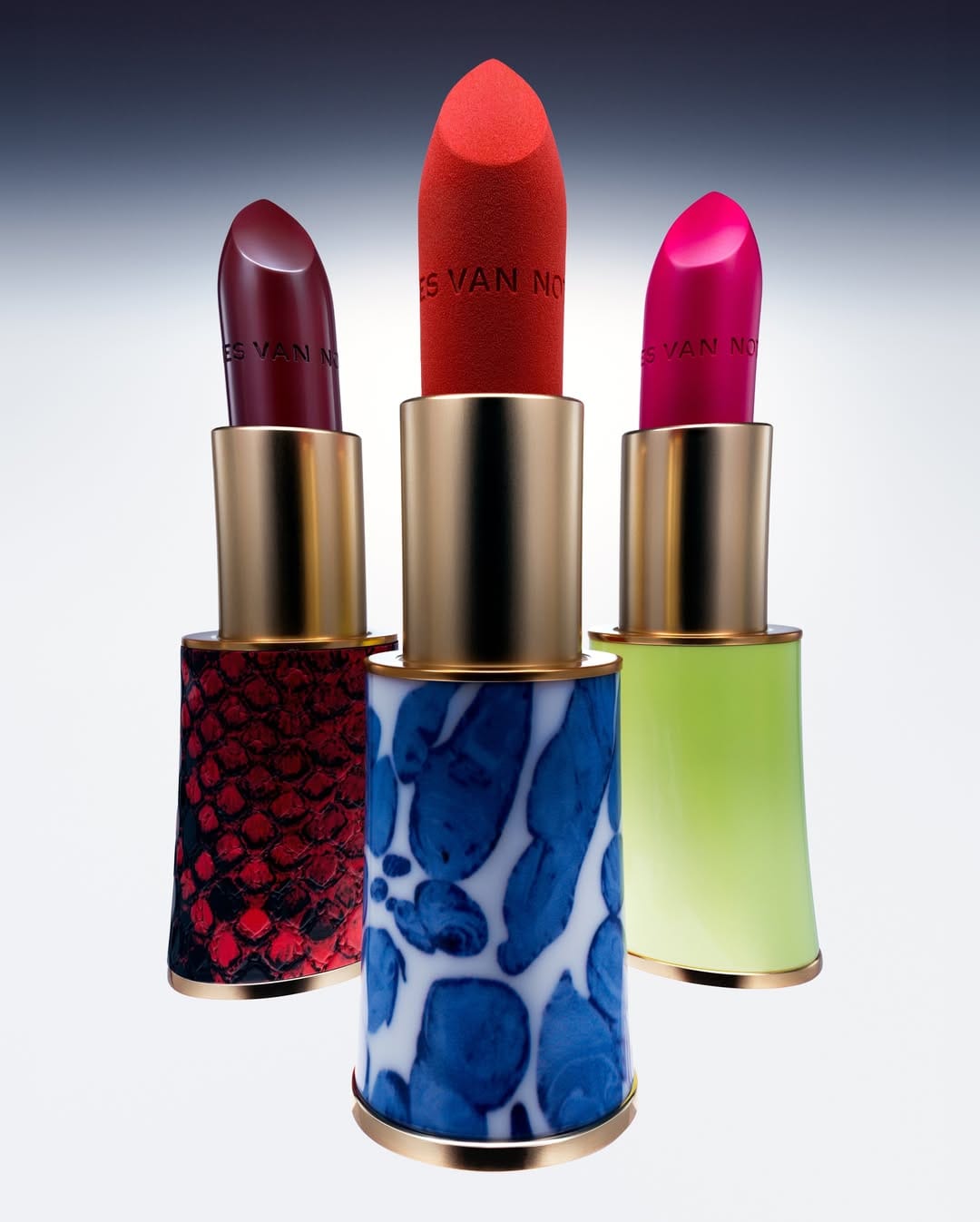
Rhode Skin blush sticks
clean minimalism, true-to-shade color
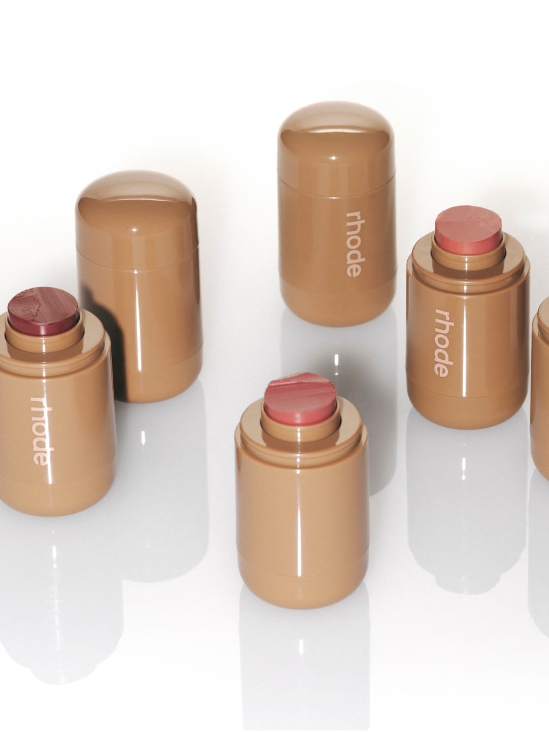
This shot is clean from Rhode (@rhode). Six blush sticks rest on a glossy white surface, no clutter, no noise, just the product given room to breathe. The lighting is soft, but with a hard edge that gives you the real picture without polishing it away.
A few sticks are uncapped so you can see the actual shades: berry, mauve, dusty pink. Smart call, you take in the whole range at a glance. On brand? Completely. The taupe caps and lowercase logo say Rhode without trying too hard. The retouching is minimal and not plastic, and the bit of texture left on top keeps it feeling real. Solid, clean beauty product photography.
My one gripe is that it plays it safe. There's no face, no mood, no moment that makes you want it on your cheeks. It sells the product well, but it doesn't make you feel much. This product-only layout fits Rhode's minimalist approach, but add a single lifestyle shot to the lineup and it's perfect. As is, it's pretty, but a little cold. 8/10.