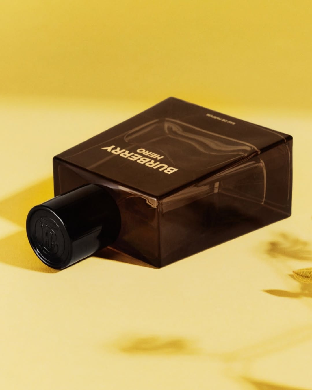
Burberry Hero
Unconventional gradients and questionable background choices
Not sure what's going on here with Burberry (@burberrybeauty), but from a commercial product photography perspective, there's a whole bunch of issues starting with the choice of background and the muddiness of the color on the bottle because of it. Also, I have a question about the darker yellow part of the background that creates this tension point where the perfume corner touches it. So it's either a bad photo or the work of a genius who broke all the photography rules. The most commercial-looking element is the cap—nice highlights showing the Burberry logo.