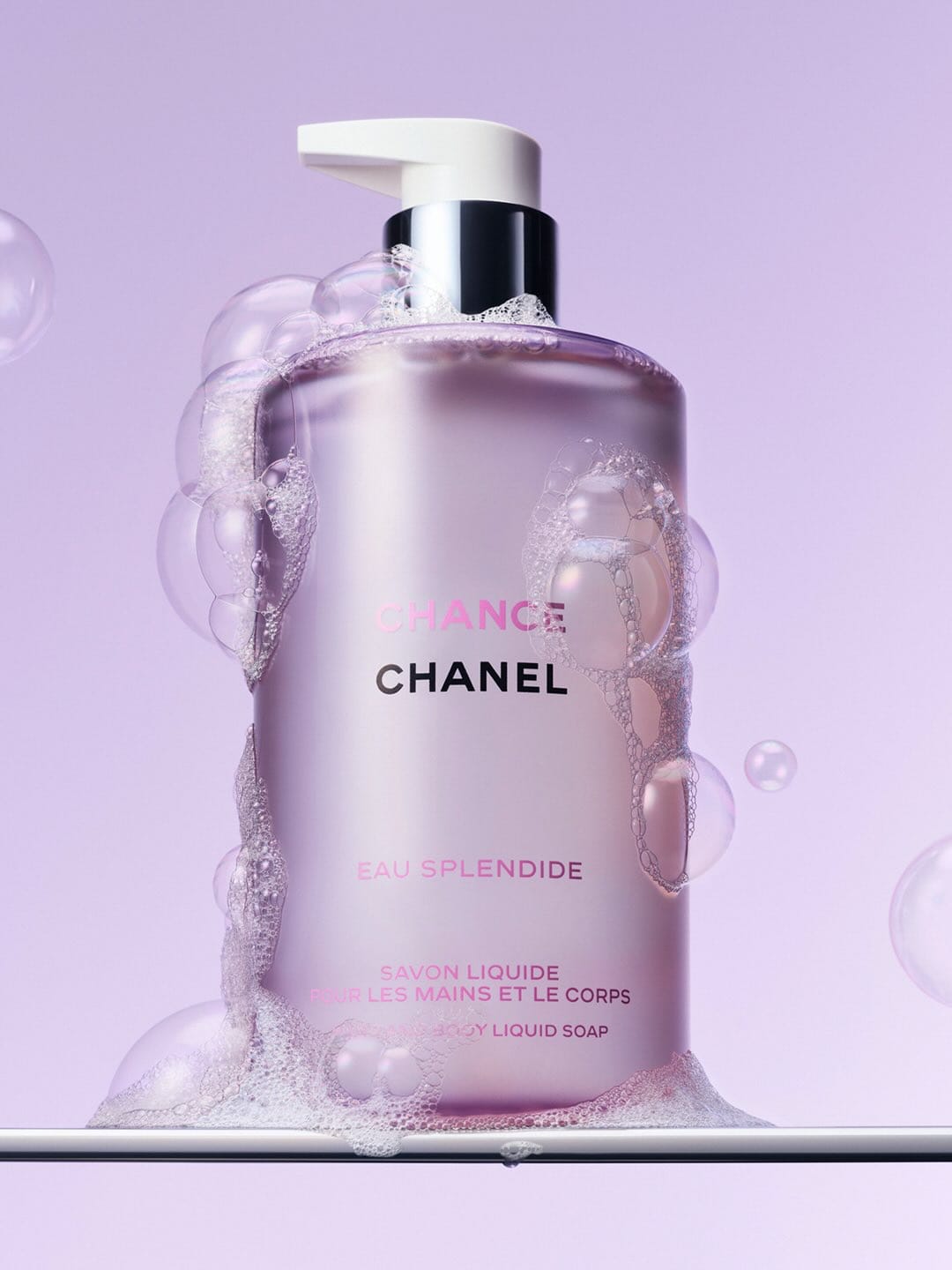
Chanel Chance Eau Splendide
Warm, saturated departure from brand codes
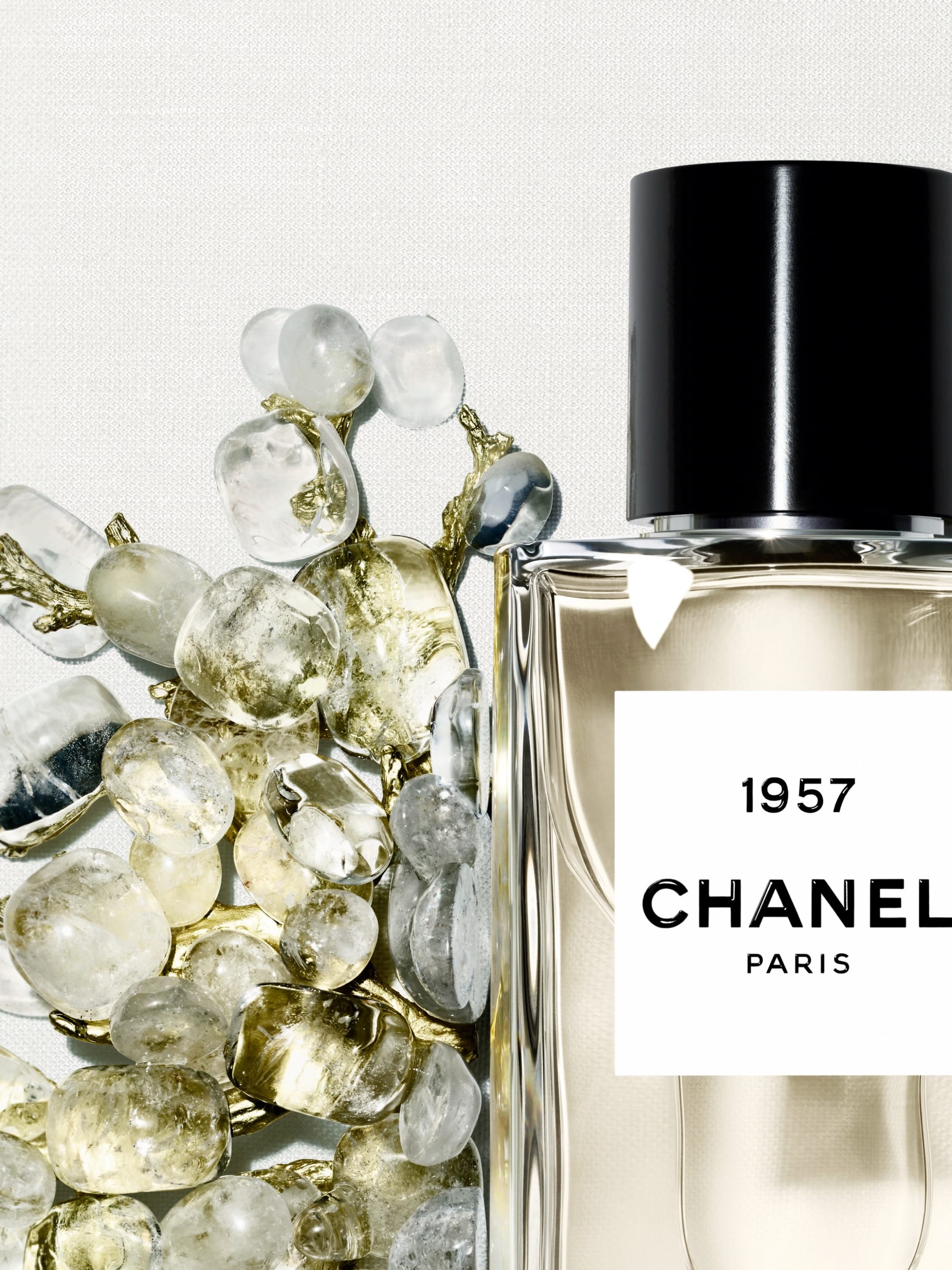
This Chanel (@chanel.beauty) Chance Eau Splendide soap image feels slightly off-brand. The color story and density are fighting their usual codes. The pink is warm, candy-like, and spreads across liquid, label, and background, pushing it toward cheerful body care rather than controlled, architectural luxury. The label is busy with long product names and copy, so instead of one calm, dominant signifier (the classic square bottle, the double C, a single word), your eye is juggling blocks of text. Chanel's strongest imagery usually rests on sharp contrast (black/white/beige plus one precise accent) and a lot of negative space. Here the frame is saturated and chatty. It reads as a strategic attempt to tap into manifestation, ritual, and joy for a younger audience under new fragrance head Simona Cattaneo, but visually it dilutes that strict, sovereign elegance that makes a Chanel object instantly legible from far away.