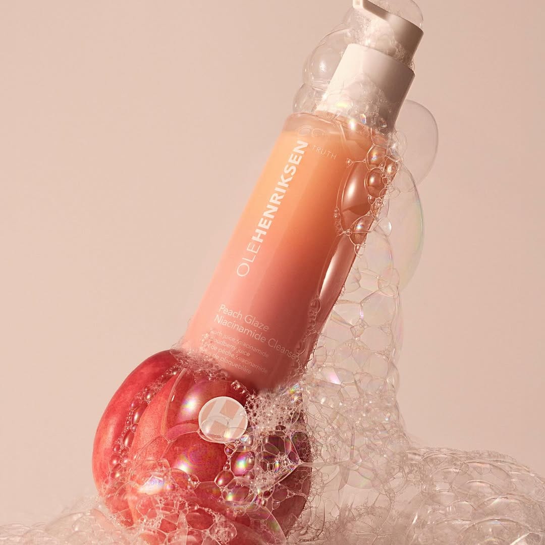
OLEHENRIKSEN Peach Glaze
Soft light meets foam texture challenges
New products alert from OLEHENRIKSEN (@olehenriksen)! I love the bottles and the colors, but not a big fan of the photos. First, the foam on the cleanser looks very overpowering in one of the main images and reads more like dish soap foam. I feel something more gentle would work better, given that soft light and Peach Glaze name. I'd understand it if this was a body wash. Also, I feel like the fact that it's brightening should introduce more direct hard light. Right now it's more "soothing" than "brightening." Not sure if it's a campaign shoot, but the cleanser photography could use more polish.