Tom Ford fragrance photography
Warm amber tones and ingredient styling
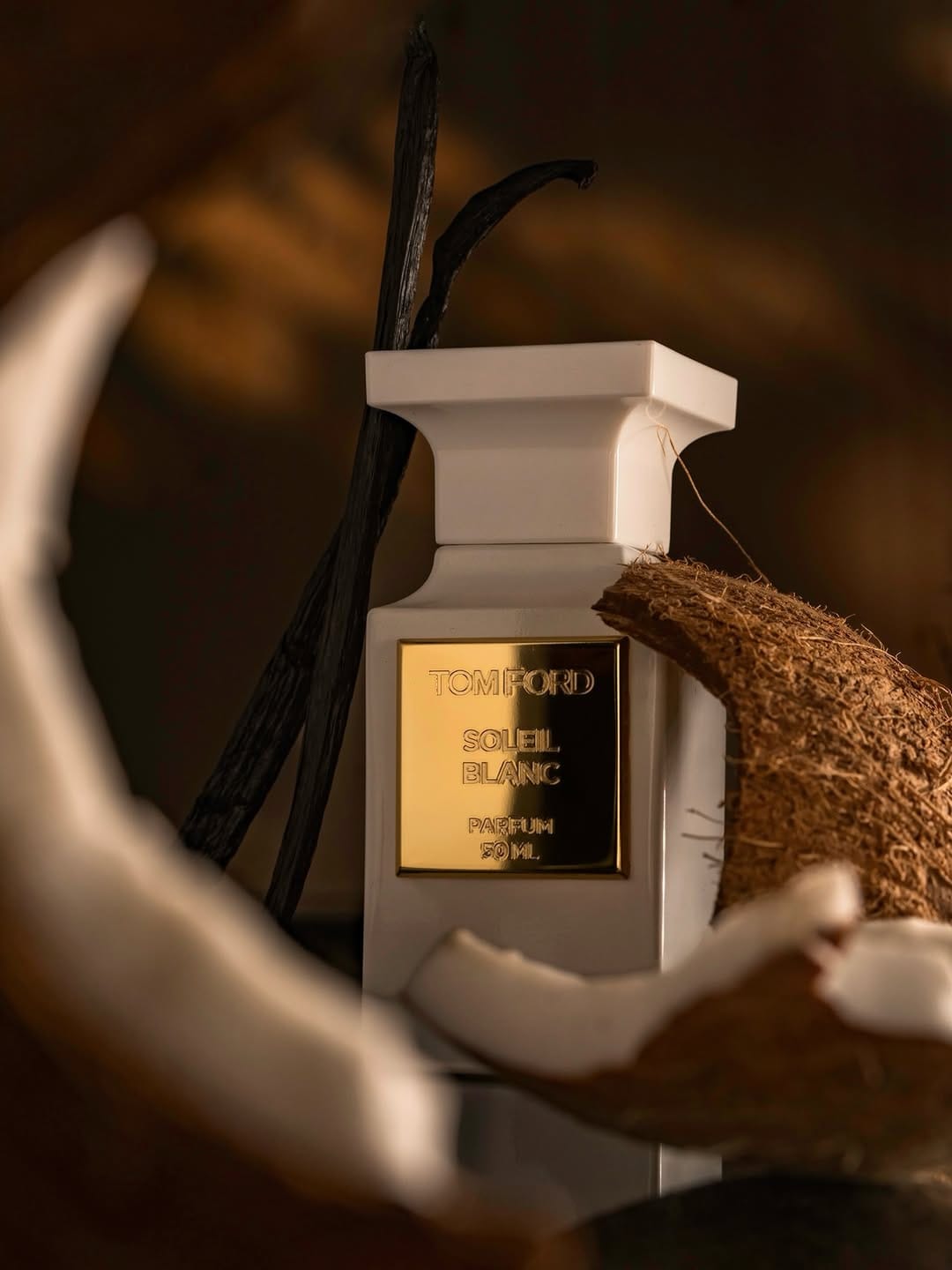
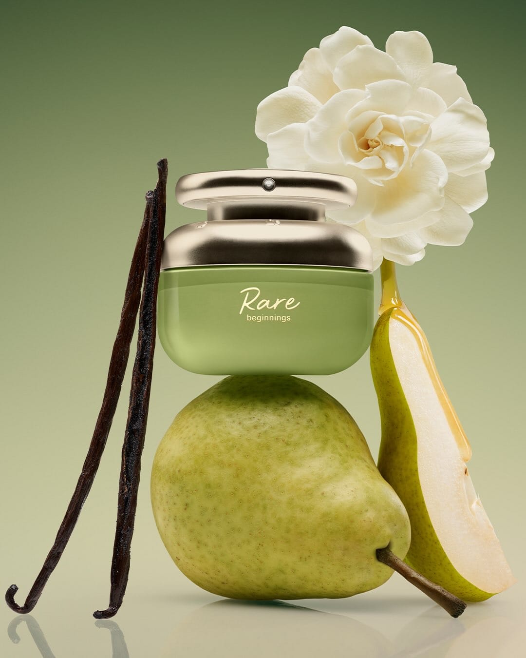
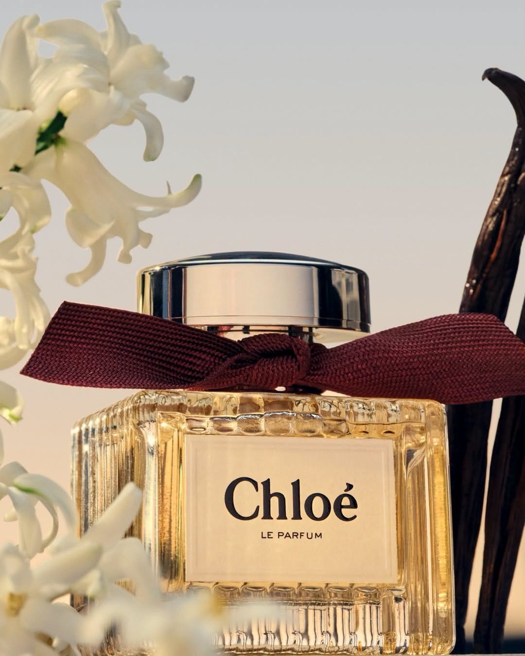
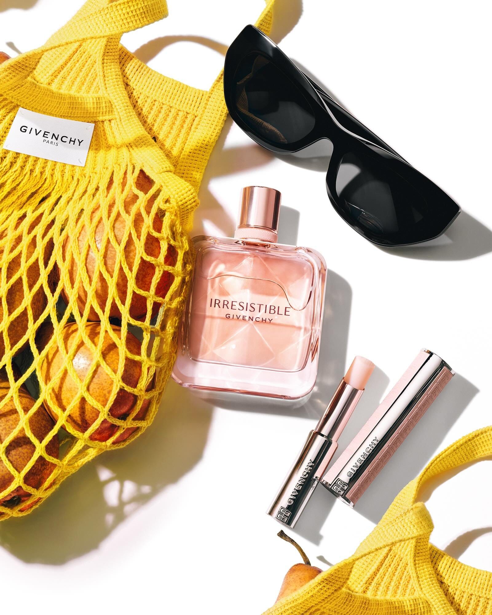
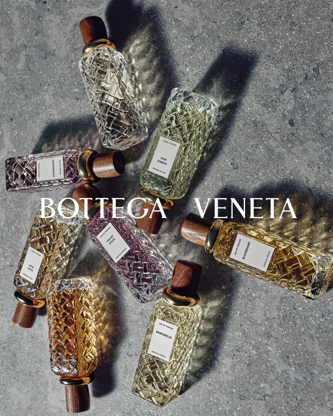
This reads as a personal project more than brand work from Tom Ford Beauty (@tomfordbeauty). The warm amber palette and ingredient styling communicate the fragrance notes well enough, but it doesn't align with Tom Ford's actual visual language, which is cooler, more controlled, and far more minimal. The series leans into moody and textural in a way that feels like the photographer's own aesthetic rather than the brand's.
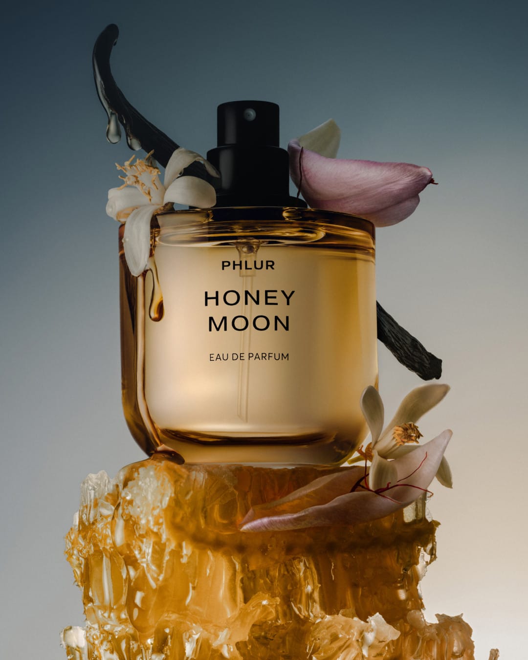
The bigger issue is the repetition. Coconut and vanilla beans appear across multiple frames without the composition or perspective changing meaningfully enough to justify it. By the third or fourth shot covering the same ground, the series loses momentum rather than building it.
For brand use, a carousel like this would need a clearer editorial logic. Each frame should advance the story, not revisit it. Here the variety isn't quite there, and neither is the brand alignment.